
My own kitchen redo: I am planning to repaint the walls from yellow to white/gray this year.
One of my favorite kind of stories to read on the design blogosphere are the redos, the renovations, the remodels: the sagas of taking a terribly ugly room and making it beautiful. I especially love the tales where the blogger did all the work herself – with no help from painters or carpenters. I’m in complete awe of those women because I am all thumbs! I couldn’t even paint a wall without ruining it, consequently, I have to hire out even the smallest of jobs.
When putting this list together – it seems that all of my favorite renovations happen to be done by favorite bloggers, those whose blogs are my go-to each morning. Do you have a favorite renovation story of 2009? I’d love to hear what your favorites were this year! My own top ten was hard to narrow down because there were so many great ones. I’m sure I am leaving out some wonderful project done by someone extremely talented – if so, I apologize! My only criteria was that the renovation be in the blogger’s own house – it couldn’t be a job done for a client! And so, here are my favorite Top Ten Renovations from 2009 (in no particular order:)

Holly and her precious baby girl Wren
1. One of my favorite blogs is Life in the Fun Lane starring Holly who has her own business, Whiteberry Reinvented, where she takes brown vintage and antique furniture and turns them into gorgeous white masterpieces. She and her husband moved into their new house last year and have totally redone it – taking up all the carpet and laying down the most wonderful almost-black hardwoods. Each room’s decor changes with the inventory – a newly finished Whiteberry piece will go inside the house until it sells. You never know how a room is going to look from one day to the next as her furniture sells so quickly. Holly is a tremendously popular blogger – and why not? Not only gorgeous, with a gorgeous baby girl Wren, she is hugely talented, the Canadian version of our own beloved southerner Layla Palmer.
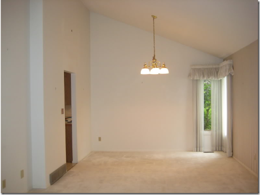
The dining room as it was when Holly bought the house – a sea of white carpet and wallpaper along the right wall. The draperies and light fixture are just too gorgeous, no? But Holly could see beyond all this. She knew she could make her house fabulous:

At first the dining room looked like this – with the new, almost black, hardwoods. It didn’t stay like this for too long.

For a short while the dining room looked like this – I loved this version with the large antique window and mirror and oval table. But Holly had other ideas.

Recently she had slipcovers made for her Craig’s List wing chairs and she recovered and painted the set of vintage chairs. The window is now to the right, resting on the floor. I loved this version too, with the touch of turquoise on the table. But alas, Holly had other ideas, again.

A new chandelier, redone and repainted by Holly was recently added – I love it! Holly tells us she paid just $15 for the chandy and $20 for the wing chairs!!! Wow! She has moved her old slipped chairs back into the dining room, the vintage chairs went into the breakfast room. Here is how the dining room looks today – maybe. Who knows? And that’s the fun of Life in the Fun Lane – each day is another look, another vignette, another project. Glance back at how this room looked when she moved in – the transformation is amazing! And be sure to visit her blog to see her bedroom (fabulous), her nursery, her living room, her family room, her entry – all wonderful!
![[IMG_4862.jpg]](https://blogger.googleusercontent.com/img/b/R29vZ2xl/AVvXsEgjOCmxq1esRaPLEtbcnFhWK-D87fYh6DpXxKtrRxxBDQu_LrRzNykESTLecRAGERCRLorg7c9XUk36xwSpiU9UHsaXoegNljzJmwnqjHiAlHRCptxbh7pNVseIfM5TsPQzqzbgs0V9Zjo/s1600/IMG_4862.jpg)
The darling Laya Palmer
2. The Lettered Cottage: Layla Palmer and her rock star husband Kevin live in a darling cottage - somewhere in Alabama – that they totally remodeled themselves! Layla is one of my favorites, even more beautiful inside than out, if that is possible. Layla’s star is soaring – she recently starred on a decorating show on CBN where she remodeled a room for a pennies – and of course, it’s adorable. Watch the show here. Besides being on TV, the Palmers have teamed up with the True Value Hardware – DIY Squad and are sure to be headliners of the group. If you have ever wanted to be friends with a star, this is your chance now, Layla is headed for major stardom and it couldn’t have happened to a nicer person. She is amazing, adorable and a blur of energy. Together – Layla and Kevin have turned their drab, dark house into a bright, charming cottage. To find only one project to show here was almost impossible – the entire house has been redone! Right now the Palmers are finishing up a major bathroom renovation, so I will show you the outside of the bathroom – their renovation of the hallway.

The Lettered Cottage was built in 1950 and added onto in 2003. Recently, Layla discovered that in the older section of the house underneath the sheetrock was wonderful planked wood ceilings and floors. Here is how it looked when they bought the house – peach painted walls and awful carpeting, but it didn’t stay this way for long.
![[IMG_4372.jpg]](https://blogger.googleusercontent.com/img/b/R29vZ2xl/AVvXsEiMFX9yDVBwP3WhTHa7D4ys1BKdReNt_z-mZmX6wNmhQQe8G4OAf4SgEhVxWL48u_XAA_oGooa5R5jJ9oZg0-D9LU0N8TwvcdwO3YSKqDQLZk6Nol0PCJSsXH3XQQgaEiguiTpPMrnyVeg/s1600/IMG_4372.jpg)
In progress, the sheetrock is removed and the plank walls are revealed. Next to the bathroom is the “reading room” – a tiny guest room that doubles as a wonderful place to nap!
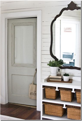 And here is the same spot today – planked wood walls, painted white, wood floors (they are really laminates that are a temporary fix until they tackle the hardwoods underneath) and the new/old bathroom door with its frosted glass window. Wow. Could it be any more charming?
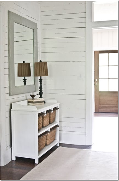
Originally Layla used this mirror above her linen press. This view looks toward the living room and their new front door with glass that lets in tons of light. Also, notice the new transom that was added to the doorway leading into the living room. Layla adds details to every inch of her house – which makes a huge difference to the decor!
![[HALL.jpg]](https://blogger.googleusercontent.com/img/b/R29vZ2xl/AVvXsEjMkmSwtB0NWOtDohfn_NlYXrFSPnYjmkPM0KjePRrSt-K-tXloq0Vua2rXeP6mD1p9ZLUEVBHzw61_1Q3SiVxvCpC4_2CWmnOgsMCwEfBVDQ-LmuIBDQ2zVDMG8KmM1V2PjzhPZ-cZeI8/s1600/HALL.jpg)
The same view – before. Here you can see the sheetrock walls and ceilings that was removed, along with the carpet. A transom was added above this door to the living room. And – you can also see how the paneled living room was originally stained a dark brown – now it is painted a light color. What a difference!!! And the Palmers do all the work themselves!
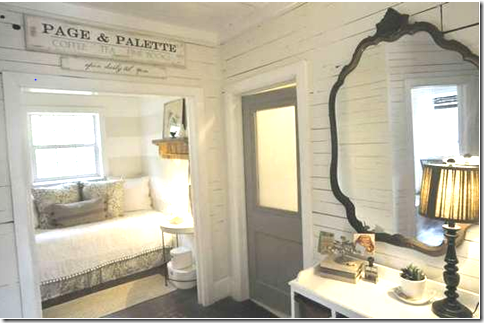 Another “After” view of the reading room and the door to the bathroom. Notice the sign above the reading room. Layla had it custom made for her by another blogger, Susie Harris, HERE. love, love, love this!!!!
![[Sign_Idea.jpg]](https://blogger.googleusercontent.com/img/b/R29vZ2xl/AVvXsEg82VqHysMxTjSdPtBntWuDuNn5dMRmVhsg2bWdv9UnyrV_imXx7AdmEhFzh7yfx8Y-_ru5CXBHUu2Jj4zIXuxEql1iuLh2CfVPGvDNYnsqmrS5452OaRMKMxTwAK-4fyoZKU7RSh3Io34/s1600/Sign_Idea.jpg)
The charming reading room with its new sign – too adorable, just like Layla!!!!!
![[me+and+the+girls.jpg]](https://blogger.googleusercontent.com/img/b/R29vZ2xl/AVvXsEhmwiqnKx0oija1s6lE5ta_MHVZuozi4hxuJTZGaz88TQ75JQ77SGs01M90l_-6YZ5k7bCJppgJc9csVkORCTU-Z6UTXzPZJx8izcwd-JwPS9v4VXCWDg9YyJyw4WVanEvVFd8WQlsWv1s/s1600/me+and+the+girls.jpg)
3. OMG – Chris, what can I say about Chris Kauffman who writes Just Beachy? I mean, to look at her, she appears to be a beautiful blonde (do I see a trend here?) mother, housewife – but don’t be fooled – beneath that exterior is a 300 pound construction worker that is living inside her body! From Canada, she dreams of living in a shingled house in the Hamptons. Somehow, in the cold, frigid northern air – she has created that beach house. There is nothing, nothing this woman has not done to her house and it looks fabulous because of her. Believe it or not, she does it alone – without any help from her husband. This year she is building out her basement, alone. I have no idea when she even has time to blog. She is always knee deep in some mind boggling project – she built her kitchen island, she has added molding to every surface of her house, she put beadboard on her family room’s ceiling, she totally redid her staircase, and her bathroom, and her daughters rooms and their bathrooms, and her living room. Her dining room changes daily. She is a powerhouse. I am in awe of her talents, discipline, and her self taught abilities. She is fearless. She is a wonder woman. Choosing one project that she has done this year was almost impossible, but I settled on her bedroom. To her it was “nothing” – just something to do one week when she was bored. I would have ended up in the hospital in traction if I had done what she did. Here is her bedroom, before:
![[DSC01387.JPG]](https://blogger.googleusercontent.com/img/b/R29vZ2xl/AVvXsEi0bR-HgAOB9jb1H0YzCVxovywB4nG5vws1xfvQ5Zu4SKyFCYpF7e38N2shTCWO-85ebZ6xoh8_DUjzrav8u-8QTIsd-n1dF7e315WOIqnFeFgqb6REIgKoEtttTeh0dZ0ZGjiPv9CY-Uk/s1600/DSC01387.JPG)
The walls were painted a deep chocolate brown – the furniture is white. It’s definitely got a beachy vibe going, but not enough for Chris and her power saw. I would have been very happy in this room, but Chris doesn’t leave anything alone for long.
![[DSC02537.JPG]](https://blogger.googleusercontent.com/img/b/R29vZ2xl/AVvXsEjwKXYebVx1m5PPuyzOIHVoDryzjRtT7ySeMFPtlWLUzv99oRUMUYsQISDfzdySOpSs3VXkqJYTdqOmtwdlRzxADgCaFa9BX7fiu2uiF_tRnijNAvCHqA2EEtQNGsFmrOrThrZqGv-N04k/s1600/DSC02537.JPG)
After: Chris completely wrapped her bedroom in wainscot. It instantly raised the cottage/beachy feel up a notch or two, don’t you think? It’s so charming, so cozy, so beautiful! Here she shows off her new capiz chandelier. On top of being able to redo and fix everything in her house, Chris is an expert thrifty shopper. She finds the best bargains and shares all of her sources! She recently started her own design business, if you would like to contact her – do so HERE.
![[DSC03270.JPG]](https://blogger.googleusercontent.com/img/b/R29vZ2xl/AVvXsEiKViWSEarqCTXk0AfPgsYbyDyL3NXc_9-dmxwVzddYE69QtV9-cH2UGm70bbMiSlj54wQEgfkcl4Unorz_O5ukh2epYwmAg9cHlIAv5p__ZO3x8C4eiUCYNwoHlvn2IoAdQ35yzT573no/s1600/DSC03270.JPG)
On this wall in the bedroom, she put pictures of her two daughters in matching frames. Chris installed the wainscot all the way around the room. For a day or two she had painted the room in a soft aqua, but no – she didn’t like that (I did!) so she repainted it this soft taupe color. I can’t wait to see what Chris tackles next – stay tuned!!!!
![[DSC01796.JPG]](https://blogger.googleusercontent.com/img/b/R29vZ2xl/AVvXsEgWQ7yOI0Ir84YbtFh1vMOXqqsnYDB5mbjt4Aj2QbJPHD7o8GGFjCCsyvj1i4F_sDHDFVTf6xK3QBxqbARNV2U6u4LmFDFKdAnFdU5EclQ7jQjVn6KTNzeZwaYN50pmjyyQfOWX6E9RCZY/s1600/DSC01796.JPG)
Here is her old chandelier that was there before the capiz. Aren’t the end tables darling – she painted the stripes. Next, she hinted that she will be replacing the carpet with hardwoods. Of that, I have NO doubt!!! Nothing is too big a job for her – she loves to challenge herself!
![[DSC01805.JPG]](https://blogger.googleusercontent.com/img/b/R29vZ2xl/AVvXsEiNi5wX2tepZtJYBF2UDS5mB1JNb0eYQ88mIrvD9jmnC0CWovUoZKP1NyokO9QsxdSGLDqMfwK4KdFvzMyhinQdSiDSROofpycLmyFp53_YhmVuHbFrftiWtErZ_IxcbP72IYlZaNp4dO0/s1600/DSC01805.JPG)
Close up of all the beachy stripes in her bedroom. Great job Chris – looking forward to seeing what is next on your agenda!

4a. Finally, a brunette! Interior designer and Velvet and Linen blogger Brooke Giannetti sits between her too-handsome husband architect, Steve Giannetti and the fabulously talented interior designer Windsor Smith – photo taken at Windsor’s house. There is more talent sitting on that sofa than in my entire neighborhood!!!!! Brooke has two houses, one in Santa Monica by the beach, and a weekend house in Oxnard. So, she gets two projects! Both are absolute favorites of mine.

The choice at the Oxnard house was difficult to make – besides gutting this powder room, they redid the landscaping. But this project is just too fabulous to pass by. Here is the Before picture: an outdated, long, built-in vanity, boring floor, and an odd ceiling line. The room was completed gutted and the ceiling became a gentle arch.

After: WOW. Brooke and Steve laid a new stone floor and added a stucco like finish to the walls. The vanity was torn out and replaced with a Chelsea Editions console. Outside, an old shutter was placed against the wall with a table of plants before it. The French door is also new.

The antique mirror was purchased by Brooke in Round Top and the antique marble sink came from Big Daddy’s. Instead of a traditional faucet they used a spout from a fountain. I love the industrial touch of the wire basket below. The lamp with the Venetian shade is a perfect addition!

Across from the sink is another area, with shelves, an open area closed off by a linen skirt along with a wall of botanicals.
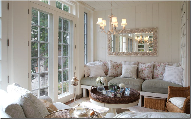 4b. Before (yes, before!) At Brooke’s house in Santa Monica, she needed a new home office. She had outgrown the desk in the kitchen set-up she had been using and decided the sitting area in the closed-in porch would be the perfect place. I was slightly horrified when she announced she would be dismantling this beautiful vignette. It was one of my favorite areas of her house!!!! But, of course Brooke knows better than me. Maybe that’s why she is a better designer than me!
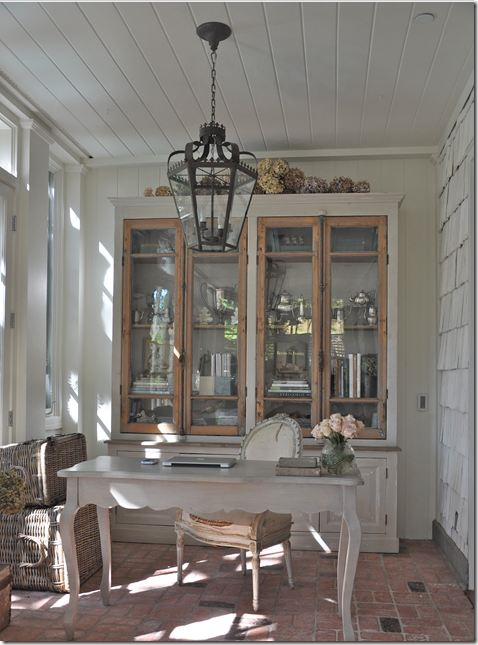
After: Brooke’s beautiful new study! Gorgeous! The large bookcase is from Bobo’s Mark Sage and the French desk is from Tritter Feefer. The chair is an antique with its original stuffing decadently spilling out. The brick floors and the plank ceiling add the texture. This room is so wonderful - I would never quit working!

The large lantern came from Wisteria and then Brooke filled the shelves with hotel silver, shells and books. Dried hydrangeas add the perfect touch at the top. Great job Brooke!!! It’s drool worthy.
![[evie6.jpg]](https://blogger.googleusercontent.com/img/b/R29vZ2xl/AVvXsEgv-wuiEo5PDgUBEzZOqPcRO5e_-FGVgDpumCPY_jIHWZM2q4AN57o7mJjeMkWAFrp1BMjy5LjoEQWmSCtTK7bcc89b2yzDZ2sMFier3Hx__9Om0jihAPqrCDnHniIAnGj5QSecj7ATyp0T/s1600/evie6.jpg)
5. Jenny of The Little Green Notebook is another blogger with a huge following. She also is the new mother of her third daughter Evelyn Jane, born on Christmas Eve – perfect for her nickname, Evie. Be sure to visit her blog to read the story of her birth – it’s as amazing as Jenny is! Jenny recently moved into a new house, but the family won’t be staying there for long, so redecorating is done with moving on to the next house in mind. Jenny’s palette revolves around Schumacher’s Chiang mai Dragon – and greens, blues, aqua and reds are found throughout her house. She recently redid her office – and it is amazing. She did it on a shoestring, for the cost of a meal, and it couldn’t be more beautiful!!!!!
![[before.JPG]](https://blogger.googleusercontent.com/img/b/R29vZ2xl/AVvXsEg39Coqehj6E7DxpVugnR-WXflSzrHCPaP2x-MeOKHw40t_2DglJ3oNjYq6v70LzadRw-br87D0mkDpxK8kyuHhwAB0WW4Cm3YCOXn1f1Pke40aUAYa1ymkrw0x3WPpQYBViot53s3XVoYr/s1600/before.JPG)
Here is the Before – the office has architectural potential, a wooden ceiling, brick wall, and a wonderful window. Wait until you see what she did!!!!!
![[IMG_0732.JPG]](https://blogger.googleusercontent.com/img/b/R29vZ2xl/AVvXsEjPSjZe86Ukga0YnOCHrOlF03xyNnmD2-3NRPwKeJG6maZhfHbmfTU7426IaetVwwJwCET3YmyjWxhJPDIpZYsTnMlsfE13Htv2Pq5qehLiUDDGYPg9kF0Hg6cuI4x6VhBvhrUFh3oykhK6/s1600/IMG_0732.JPG)
Jenny spent a total of $45 redoing her office. $40 of it was spent on this dresser. Unbelievable! In my redoes, I spend more than that on mistakes. Shame! Shame!

After: the console is now a vibrant lacquered red that is the focal point of the study. The dhurrie rug from IKEA sets off all the colors.

She used fabric to make the two bulletin boards that are both functional and decorative. She also painted and trimmed out the boxes to match the room.

She painted the old parson style desk a soft minty green and made the shade with the added red grosgrain ribbon.

The hardware makes the piece! It’s amazing – it came with the dresser and Jenny just shined it up. Do you think you could take a room from nothing to this for $45?????? Jenny is an interior designer – contact her at Pearl Street Interiors, HERE.

Remember little Evie Jane, born on Christmas Eve, you see that ottoman? wink, wink. Go read the story – Jenny is an amazing woman is all I can I say. I wish I could draw from her strength and stamina!
![[IMG_2362.JPG]](https://blogger.googleusercontent.com/img/b/R29vZ2xl/AVvXsEjzp1Ex24rMqEWZ9PD-19lPwjm2CGsB1V2IKOwLIQa1vbeRKrZZMBl1fViPJn9iprv9Uxl-h4kupDE6UdbgsZskCJT4Rj4jtOkeKrR6WxH_B1NrmAwVsDtyW6zAsBahYZBPSKYquKFLW7wf/s1600/IMG_2362.JPG)
6. Beth aka Chinoiserie Chic on the left, and the great interior designer Alessandra Branca on the right. Am I jealous? You bet!!!
![[IMG_1586.JPG]](https://blogger.googleusercontent.com/img/b/R29vZ2xl/AVvXsEisWCodemo-sWgM11ictXB-HRjkAN2A6VelRvQZn6WuKxINJlTZMeElDi7DM0MQr5561BEA9svoWlEcoPX_LnbcuOfJNHfcogJMvdreJTnqLLKZT0vyYEgCXzMu97-9gKV3QTQpSdynOJXd/s1600/IMG_1586.JPG)
After: Chinoiserie Chic redid her grown daughter’s room into an fantasy escape for herself! I don’t have the before pictures, but the after pictures are so beautiful – this is one of my favorite bedroom redoes of the year. Beth, who writes Chinoiserie Chic, purchased the bed from the Annie Selke Collection – and named the new room ‘The Pagoda Bedroom.” It’s a beauty – don’t you think?
![[IMG_1605.JPG]](https://blogger.googleusercontent.com/img/b/R29vZ2xl/AVvXsEiklBug5B4dXRCihBKnG2L_NKiKHUOjjopGW0VVFrb1QLsJWUdzePqmSdDzDZ5XfpK2DYsBdKX1uexnbWv9D1kQ0tzw75ePTqC9zxNYHY5Y8HpkRSgKwgYEAug9z5_O1ThAY_LdZ7A9RLBf/s1600/IMG_1605.JPG)
I love the blue and white toile wallpaper and the silk curtains in the bedroom.
![[IMG_1587.JPG]](https://blogger.googleusercontent.com/img/b/R29vZ2xl/AVvXsEjpN8HWbftVkhsSe2qfKuQOLNusriUT_5Jdpxv-96JhkLkCSDCWTPZAlV2BbSx63ALx7BpKBosUjglm3pPlRhn8b1R87KxMdQ1GyQaeXtnqXMMYFE0DEztmPzaW3Po7UDHjStXnviGrra12/s1600/IMG_1587.JPG)
The en-suite bathroom continues the blue and white chinoiserie theme! Wonderful job Beth!!!

7. Gina who writes Willow Decor stands to the right of the Visual Vamp on a shopping/business trip to New Orleans.

Before: The quietly beautiful blog, Willow Decor, is all about Swedish design and Gustavian style, with Belgian and European interiors thrown in for good measure. One day, the gracious Gina stunned us all when she revealed her Butlers Pantry that she had been creating. Stunned is putting it mildly. I could barely lift my chin off the keyboard. It was one of the prettiest pantries I had ever seen. There are many projects that Gina has shown this year, but her Butlers Pantry remains top on my list. Above is a picture of how the small room off her kitchen used to look like. Get ready for the reveal below!
![[20090104_0162.JPG]](//4.bp.blogspot.com/_tSGOcFKOoqI/SWojQzHE8DI/AAAAAAAABGw/DFDMqVIbDII/s1600/20090104_0162.JPG)
Today the small room is ceiling to floor cabinets painted the most gorgeous shade of gray! Of course the countertops are white carrara marble. There is a small desk here under the window that Gina uses for her computer work. Just stunning!!!!!
![[20090104_0164.JPG]](//4.bp.blogspot.com/_tSGOcFKOoqI/SWojQH6H9jI/AAAAAAAABGg/rSlVIa2beSM/s1600/20090104_0164.JPG)
A glimpse of the wood paned window. I love the hardware she used.
![[20090104_0163.JPG]](//2.bp.blogspot.com/_tSGOcFKOoqI/SWojQofrYzI/AAAAAAAABGo/GIMB0iumbaA/s1600/20090104_0163.JPG)
An appliance garage hides the ugly stuff! A set of green and white dishes are highlighted in the center cabinet. The beadboard is true wood tongue and groove – more fitting for the house, built in the 1930s. Gina says she plans to roll out dough on the marble counter – I’m sure she did plenty of that this Christmas. I would love to have a dedicated room like this for all my kitchen things, it is just beautiful!

8. Here she is as a bride a few years ago – today, Lauren from Pure Style Home is a mother to two small boys, one of whom was just born on this December 22! Lauren is another interior designer of great talent. I just adore her style! Earlier this year she moved into a split level house. Literally within days, she and her husband had redone it all. Lauren, like many interior designers, changes her mind and moves her furniture around on an almost daily basis. Her blog is full of her redoes, her ideas, her designs. It was hard to pick just one project – for the whole house was changed! But I settled on the one that made me gasped when I saw it – the entry hall!

Before: A dark place that links the ground floor, the basement, and the upper floor where the living room is. When I saw this – I thought, well good luck. What on earth could Lauren do to this? Just wait:

Today the entry hall is a bright space that doubles as an art gallery! I couldn’t get over the change that 30 framed prints would make. They look wonderful! All the prints are by Leonardo daVinci – so not only are they nice on the wall, they are nice on the eyes. And that chandelier! Perfection!!!!

Here’s another view from Before.

And after. Lauren chose to hang the prints in a random manner rather than a grid – and I think this was a stroke of genius. Who but Lauren would think to hang 30 daVinci prints randomly and have it all look so wonderful? She is the best in my book.
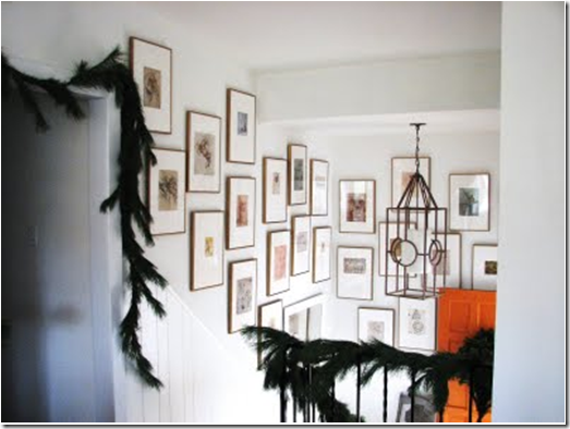
The gold frames are all 20 x 14, put together by Lauren and her husband. She also ordered full mats. Once she had hand torn out the prints from the the book, daVinci’s Notebook, she simply pasted the rough edged prints directly onto the full mats. The chandelier is the 4-feet high Minka- Lavery caged lantern from Bellacor, which she bought on sale for $200. She paid only $20 for each frame. The floor is covered in wall to wall seagrass. Lauren is a synesthete (read about it here) and she says that the entry hall reminds her of tinkling chimes – she can almost hear the frames. Her condition is so interesting, a blending of the senses, and I think that having it explains some of Lauren’s extreme creativity - her “risk taking” in design as she explains it. It is an extremely rare condition and she is lucky to have it. Lauren is so young, I look at her with wonderment - her whole life is in front of her and she will be huge one day – a household name! I just know it and I’m not a synesthete, though I wish I were.
`![[nytphoto.jpg]](https://blogger.googleusercontent.com/img/b/R29vZ2xl/AVvXsEj81UH4vWIyU38ycQJz2L-uO4SK0UZFO5OTWDzBQAtwiXGxJBSFGgi5gDX4TRL4WgR_tUxY_SlLtHT_oQ-vlAIbkpPrgqOXrIfaQjKgAmMlJroMdC-0aBxo-jJ83s54GJSGhVH0hyphenhyphen7Y0BE/s1600/nytphoto.jpg)
9. Jennifer Boles, The Peak of Chic, was a blogging idol of mine when I started. She and Courtney of Style Court were the two queens of Atlanta whose blogs I admired the most and tried to emulate. They both were and are great role models for a new blogger just starting out – they do everything with class and grace. Since she started blogging, Jennifer’s life has changed completely – House Beautiful read her blog and offered her a job – something that we all dream of! She also went through some personal changes and found herself in a new house, actually a high rise condo, with a bathroom in desperate need of an update. The contemporary space was a disaster and Jennifer planned on gutting it and starting over, yet this year’s economy slowed her down. Instead she did a superficial remodel, choosing to hide all the bad parts rather than remove them. I think it came out beautifully and it really reflects her glamorous 30s and 40s style. Though not a designer, is hard to believe that judging by the job she did in this room. You will agree with me when you see the new powder room.
![[bathroombefore1.jpg]](https://blogger.googleusercontent.com/img/b/R29vZ2xl/AVvXsEhKMmIAm4vb5zIPsW5ryRVpo6uNvyw5lvghu3OYuual-fVo-MfZtJOFECTLk3xwL6XvtUjWVyr89362DzHRkKK5Ow-Lho7UKaypDiPhg9xp4G9ns_j6mfsmEWJfsYmADQznh6gFvUrGZLg/s1600/bathroombefore1.jpg)
Before: The light fixture above the sink was a major problem area for Jennifer during the redecorating.
![[bathroombefore3.jpg]](https://blogger.googleusercontent.com/img/b/R29vZ2xl/AVvXsEhXbIjSt9mqQkSt0b0PPMSTa7E3SW5oBBu0EeW5GQvfuPx3X5C8JLyRD4jaqzQvpzH0w8tMjjg_RbL38cD-Ejc5DysJKmXlqrKtbyiBGTiKbxK05mUp1OpiokN2YJmCgmyIapT8EwsfGck/s1600/bathroombefore3.jpg)
Check out the shower door and the yellowed toilet seat!!
![[bathroomafter5.jpg]](https://blogger.googleusercontent.com/img/b/R29vZ2xl/AVvXsEjPJ_GkSEDWCw-WH_oLVzCceRZmsgC6p673wDOKUTtjYH2giBCwCvmzVeUVk-npJE26s9LORHi6BQWf1byUl1Pf4acs_zeMYnwZVWBhHnA6-QVfX2PvRKFPeNN1rFTYkbHCKWNvzA4kAyIy/s1600/bathroomafter5.jpg)
After: The powder room is almost not recognizable as the same space! The room has a definite David Hicks vibe, someone who Jennifer greatly admires. The toilet is new and the shower is hidden behind a floor to ceiling curtain from Pottery Barn. The cornice is really the focal point here. Behind the wooden piece the fluorescent light fixture is hiding – if Jennifer needs the light, she can still use it. Two lamps on the sink create a moody atmosphere. Jennifer wanted a jewel box powder room and she got it!
![[bathroomafter2.jpg]](https://blogger.googleusercontent.com/img/b/R29vZ2xl/AVvXsEjcrBwcxe0h2yil7OSWHYsGS3SzRah5Zmk-ahK7BTrys8BVWkkZvBfZQWAloP5WoyYk1uv0P5ROpmlAVMtiy9Tk384buhqxHHUBGPn44GcwyumMal26t_xt7O6-Jtb4lmLKwRlsEGboTHE/s1600/bathroomafter2.jpg)
Across from the sink is a wall of prints in gold frames. Another glamorous touch. The walls are a dark blue from Benjamin Moore: Soot.
![[bathroomafter1.jpg]](https://blogger.googleusercontent.com/img/b/R29vZ2xl/AVvXsEgaNos2d3TxgCh-9RtiW-qGTxnR7dKLUCKRBsGflK00-eGtEo70UQL77VDaMeDeYwJknVZ7_9XqktnioLR4EKwAs_je0xPt29GCpWIBizxxMCq-yNo33zUp6wfwt6aKpg4JqJDORhvQ3zs/s1600/bathroomafter1.jpg)
My favorite part of the room is the skirt that hides the vanity. It’s a light aqua with a black and white trim for extra detailing. Great job Jennifer!

10. I left my personal favorite for last. Linda Merrill, my friend, of Surroundings who also created The Skirted Roundtable, worked on a new project this year that seemed like it took forever. It was a major overhaul of her kitchen, driven by her new appliances, and Linda and her friend did all the work themselves! It was exhausting to watch and I can’t imagine how exhausting it was for Linda! After many talks – mostly after we had recorded The Skirted Roundtable on Monday nights – Linda finally decided on a dark black green for her cabinets. Our interview with Brooke Giannetti was the deciding factor on going with Cooking Apple Green by Farrow and Ball for the interiors of the cabinets. Linda also used another blogger’s tip – beadboard wallpaper! Rhoda of Southern Hospitality is the one who introduced her to the wallpaper. When Rhoda first wrote about it, Home Depot sold out nationwide!!!!!!! The power of the blog! Linda lives in a condo in a small coastal town in Massachusetts. Besides doing interior design, she is a flautist and gives lessons to young children. A true renaissance woman, there’s not much Linda can’t or hasn’t done before! I’m so happy for her – she loves to cook and now she has all new appliances to do it properly. This Christmas, she took her oven out on its test run making batches of beautiful iced sugar cookies for her friends and family.

Before: Actually – I thought her kitchen was cute before – with it’s wood cabinets and black and white flooring. But – new appliances were coming, she needed an update!

After: What a difference! The stainless appliances just gleam against the deep, dark green cabinets. I love the floor and the green ceiling, which originally had popcorn on it – it took days to clean it smooth for painting. The beadboard wallpaper was used above and below the cabinets. It looks sooo real!!!! Linda still has to make her window shade.

The inside of the cabinets are Cooking Apple Green. I love the contrast.

The view looking into the kitchen. It’s a tiny space – but the entry way into the room is long. In that space there will be a console with a burlap skirt along the right wall.
I hope you have enjoyed my Top Ten Renovations of 2009. If you did a renovation and think I should have showcased it – let me know! Email me your project!
Here’s wishing everyone a wonderful New Years: Happy, Healthy and Prosperous!!!!!!!!!


![[IMG_4862.jpg]](https://blogger.googleusercontent.com/img/b/R29vZ2xl/AVvXsEgjOCmxq1esRaPLEtbcnFhWK-D87fYh6DpXxKtrRxxBDQu_LrRzNykESTLecRAGERCRLorg7c9XUk36xwSpiU9UHsaXoegNljzJmwnqjHiAlHRCptxbh7pNVseIfM5TsPQzqzbgs0V9Zjo/s1600/IMG_4862.jpg)

![[IMG_4372.jpg]](https://blogger.googleusercontent.com/img/b/R29vZ2xl/AVvXsEiMFX9yDVBwP3WhTHa7D4ys1BKdReNt_z-mZmX6wNmhQQe8G4OAf4SgEhVxWL48u_XAA_oGooa5R5jJ9oZg0-D9LU0N8TwvcdwO3YSKqDQLZk6Nol0PCJSsXH3XQQgaEiguiTpPMrnyVeg/s1600/IMG_4372.jpg)


![[HALL.jpg]](https://blogger.googleusercontent.com/img/b/R29vZ2xl/AVvXsEjMkmSwtB0NWOtDohfn_NlYXrFSPnYjmkPM0KjePRrSt-K-tXloq0Vua2rXeP6mD1p9ZLUEVBHzw61_1Q3SiVxvCpC4_2CWmnOgsMCwEfBVDQ-LmuIBDQ2zVDMG8KmM1V2PjzhPZ-cZeI8/s1600/HALL.jpg)

![[Sign_Idea.jpg]](https://blogger.googleusercontent.com/img/b/R29vZ2xl/AVvXsEg82VqHysMxTjSdPtBntWuDuNn5dMRmVhsg2bWdv9UnyrV_imXx7AdmEhFzh7yfx8Y-_ru5CXBHUu2Jj4zIXuxEql1iuLh2CfVPGvDNYnsqmrS5452OaRMKMxTwAK-4fyoZKU7RSh3Io34/s1600/Sign_Idea.jpg)
![[me+and+the+girls.jpg]](https://blogger.googleusercontent.com/img/b/R29vZ2xl/AVvXsEhmwiqnKx0oija1s6lE5ta_MHVZuozi4hxuJTZGaz88TQ75JQ77SGs01M90l_-6YZ5k7bCJppgJc9csVkORCTU-Z6UTXzPZJx8izcwd-JwPS9v4VXCWDg9YyJyw4WVanEvVFd8WQlsWv1s/s1600/me+and+the+girls.jpg)
![[DSC01387.JPG]](https://blogger.googleusercontent.com/img/b/R29vZ2xl/AVvXsEi0bR-HgAOB9jb1H0YzCVxovywB4nG5vws1xfvQ5Zu4SKyFCYpF7e38N2shTCWO-85ebZ6xoh8_DUjzrav8u-8QTIsd-n1dF7e315WOIqnFeFgqb6REIgKoEtttTeh0dZ0ZGjiPv9CY-Uk/s1600/DSC01387.JPG)
![[DSC02537.JPG]](https://blogger.googleusercontent.com/img/b/R29vZ2xl/AVvXsEjwKXYebVx1m5PPuyzOIHVoDryzjRtT7ySeMFPtlWLUzv99oRUMUYsQISDfzdySOpSs3VXkqJYTdqOmtwdlRzxADgCaFa9BX7fiu2uiF_tRnijNAvCHqA2EEtQNGsFmrOrThrZqGv-N04k/s1600/DSC02537.JPG)
![[DSC03270.JPG]](https://blogger.googleusercontent.com/img/b/R29vZ2xl/AVvXsEiKViWSEarqCTXk0AfPgsYbyDyL3NXc_9-dmxwVzddYE69QtV9-cH2UGm70bbMiSlj54wQEgfkcl4Unorz_O5ukh2epYwmAg9cHlIAv5p__ZO3x8C4eiUCYNwoHlvn2IoAdQ35yzT573no/s1600/DSC03270.JPG)
![[DSC01796.JPG]](https://blogger.googleusercontent.com/img/b/R29vZ2xl/AVvXsEgWQ7yOI0Ir84YbtFh1vMOXqqsnYDB5mbjt4Aj2QbJPHD7o8GGFjCCsyvj1i4F_sDHDFVTf6xK3QBxqbARNV2U6u4LmFDFKdAnFdU5EclQ7jQjVn6KTNzeZwaYN50pmjyyQfOWX6E9RCZY/s1600/DSC01796.JPG)
![[DSC01805.JPG]](https://blogger.googleusercontent.com/img/b/R29vZ2xl/AVvXsEiNi5wX2tepZtJYBF2UDS5mB1JNb0eYQ88mIrvD9jmnC0CWovUoZKP1NyokO9QsxdSGLDqMfwK4KdFvzMyhinQdSiDSROofpycLmyFp53_YhmVuHbFrftiWtErZ_IxcbP72IYlZaNp4dO0/s1600/DSC01805.JPG)


![[evie6.jpg]](https://blogger.googleusercontent.com/img/b/R29vZ2xl/AVvXsEgv-wuiEo5PDgUBEzZOqPcRO5e_-FGVgDpumCPY_jIHWZM2q4AN57o7mJjeMkWAFrp1BMjy5LjoEQWmSCtTK7bcc89b2yzDZ2sMFier3Hx__9Om0jihAPqrCDnHniIAnGj5QSecj7ATyp0T/s1600/evie6.jpg)
![[before.JPG]](https://blogger.googleusercontent.com/img/b/R29vZ2xl/AVvXsEg39Coqehj6E7DxpVugnR-WXflSzrHCPaP2x-MeOKHw40t_2DglJ3oNjYq6v70LzadRw-br87D0mkDpxK8kyuHhwAB0WW4Cm3YCOXn1f1Pke40aUAYa1ymkrw0x3WPpQYBViot53s3XVoYr/s1600/before.JPG)
![[IMG_0732.JPG]](https://blogger.googleusercontent.com/img/b/R29vZ2xl/AVvXsEjPSjZe86Ukga0YnOCHrOlF03xyNnmD2-3NRPwKeJG6maZhfHbmfTU7426IaetVwwJwCET3YmyjWxhJPDIpZYsTnMlsfE13Htv2Pq5qehLiUDDGYPg9kF0Hg6cuI4x6VhBvhrUFh3oykhK6/s1600/IMG_0732.JPG)
![[IMG_2362.JPG]](https://blogger.googleusercontent.com/img/b/R29vZ2xl/AVvXsEjzp1Ex24rMqEWZ9PD-19lPwjm2CGsB1V2IKOwLIQa1vbeRKrZZMBl1fViPJn9iprv9Uxl-h4kupDE6UdbgsZskCJT4Rj4jtOkeKrR6WxH_B1NrmAwVsDtyW6zAsBahYZBPSKYquKFLW7wf/s1600/IMG_2362.JPG)
![[IMG_1586.JPG]](https://blogger.googleusercontent.com/img/b/R29vZ2xl/AVvXsEisWCodemo-sWgM11ictXB-HRjkAN2A6VelRvQZn6WuKxINJlTZMeElDi7DM0MQr5561BEA9svoWlEcoPX_LnbcuOfJNHfcogJMvdreJTnqLLKZT0vyYEgCXzMu97-9gKV3QTQpSdynOJXd/s1600/IMG_1586.JPG)
![[IMG_1605.JPG]](https://blogger.googleusercontent.com/img/b/R29vZ2xl/AVvXsEiklBug5B4dXRCihBKnG2L_NKiKHUOjjopGW0VVFrb1QLsJWUdzePqmSdDzDZ5XfpK2DYsBdKX1uexnbWv9D1kQ0tzw75ePTqC9zxNYHY5Y8HpkRSgKwgYEAug9z5_O1ThAY_LdZ7A9RLBf/s1600/IMG_1605.JPG)
![[IMG_1587.JPG]](https://blogger.googleusercontent.com/img/b/R29vZ2xl/AVvXsEjpN8HWbftVkhsSe2qfKuQOLNusriUT_5Jdpxv-96JhkLkCSDCWTPZAlV2BbSx63ALx7BpKBosUjglm3pPlRhn8b1R87KxMdQ1GyQaeXtnqXMMYFE0DEztmPzaW3Po7UDHjStXnviGrra12/s1600/IMG_1587.JPG)


![[nytphoto.jpg]](https://blogger.googleusercontent.com/img/b/R29vZ2xl/AVvXsEj81UH4vWIyU38ycQJz2L-uO4SK0UZFO5OTWDzBQAtwiXGxJBSFGgi5gDX4TRL4WgR_tUxY_SlLtHT_oQ-vlAIbkpPrgqOXrIfaQjKgAmMlJroMdC-0aBxo-jJ83s54GJSGhVH0hyphenhyphen7Y0BE/s1600/nytphoto.jpg)
![[bathroombefore1.jpg]](https://blogger.googleusercontent.com/img/b/R29vZ2xl/AVvXsEhKMmIAm4vb5zIPsW5ryRVpo6uNvyw5lvghu3OYuual-fVo-MfZtJOFECTLk3xwL6XvtUjWVyr89362DzHRkKK5Ow-Lho7UKaypDiPhg9xp4G9ns_j6mfsmEWJfsYmADQznh6gFvUrGZLg/s1600/bathroombefore1.jpg)
![[bathroombefore3.jpg]](https://blogger.googleusercontent.com/img/b/R29vZ2xl/AVvXsEhXbIjSt9mqQkSt0b0PPMSTa7E3SW5oBBu0EeW5GQvfuPx3X5C8JLyRD4jaqzQvpzH0w8tMjjg_RbL38cD-Ejc5DysJKmXlqrKtbyiBGTiKbxK05mUp1OpiokN2YJmCgmyIapT8EwsfGck/s1600/bathroombefore3.jpg)
![[bathroomafter5.jpg]](https://blogger.googleusercontent.com/img/b/R29vZ2xl/AVvXsEjPJ_GkSEDWCw-WH_oLVzCceRZmsgC6p673wDOKUTtjYH2giBCwCvmzVeUVk-npJE26s9LORHi6BQWf1byUl1Pf4acs_zeMYnwZVWBhHnA6-QVfX2PvRKFPeNN1rFTYkbHCKWNvzA4kAyIy/s1600/bathroomafter5.jpg)
![[bathroomafter2.jpg]](https://blogger.googleusercontent.com/img/b/R29vZ2xl/AVvXsEjcrBwcxe0h2yil7OSWHYsGS3SzRah5Zmk-ahK7BTrys8BVWkkZvBfZQWAloP5WoyYk1uv0P5ROpmlAVMtiy9Tk384buhqxHHUBGPn44GcwyumMal26t_xt7O6-Jtb4lmLKwRlsEGboTHE/s1600/bathroomafter2.jpg)
![[bathroomafter1.jpg]](https://blogger.googleusercontent.com/img/b/R29vZ2xl/AVvXsEgaNos2d3TxgCh-9RtiW-qGTxnR7dKLUCKRBsGflK00-eGtEo70UQL77VDaMeDeYwJknVZ7_9XqktnioLR4EKwAs_je0xPt29GCpWIBizxxMCq-yNo33zUp6wfwt6aKpg4JqJDORhvQ3zs/s1600/bathroomafter1.jpg)
