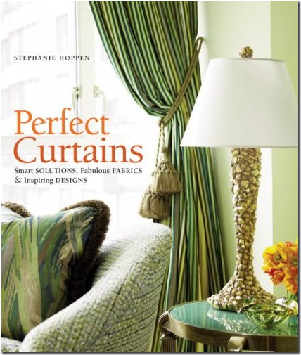
Reading my recently purchased book “Perfect Curtains” by Stephanie Hoppen – I kept stopping to linger over different photographs which all turned out to be the work of the same designer for the same hotel project. I’d never heard of the designer, nor the project – so of course being the nosey and inquisitive person I am – a cursory Google search ended up being an all day affair. I swear, sometimes I wish nobody had ever invented Google! I’d get a lot more accomplished around here if I didn’t have to go from one website to another to another just to scratch an inquisitive itch.
A bathroom in the Cape Grace featuring African Sketchbook fabrics.
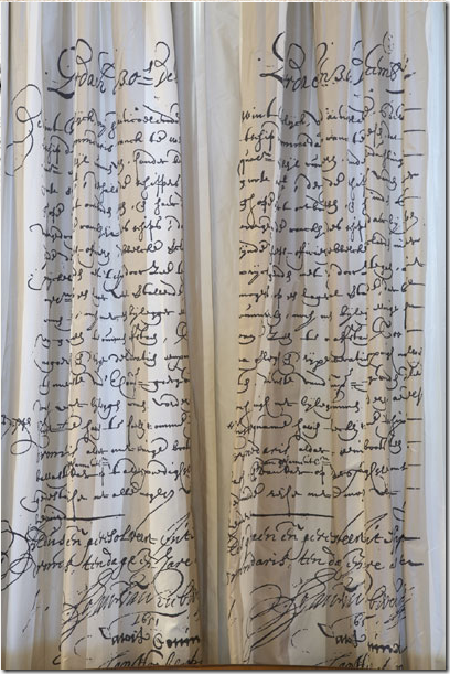
What caught my eye in the photographs was the fabric – an unusual textile with words imprinted on it. At first I thought maybe the fabric was old feed bags – which I confess I am obsessed with these days – and I don’t care how trendy they are either!!! But on closer examination, this fabric wasn’t rustic at all - rather it was refined, as if someone had taken a giant ink pen and gracefully written all over a beautiful piece of silk dupioni. What in the world is it?
Curtains made of silk dupioni – with a story handwritten all over it in beautiful script.
The fabric, I discovered, was by African Sketchbook and 6500 yards of it was commissioned by interior designer Kathi Weixelbaumer for her latest job – refurbishing the classic Cape Grace hotel in Cape Town, South Africa. I pride myself on my knowledge of fabric, but African Sketchbook is a new one for me, as was the designer Kathi Weixelbaumer. For the hotel’s decor, Weixelbaumer wanted the 150 rooms to be different – so 50 new patterns of the fabric were created to satisfy. African Sketchbook recently won an award by Elle Decor for this commission – and with good reason. The fabrics are not just a backdrop to the hotel – they actually tell the story of Cape Town’s history. Through their murals and the writings and drawings on fabric the story of Cape Town’s maritime history comes alive. Much attention was paid to the 17th century’s Dutch East India Company which used the Cape’s Victorian and Alfred Waterfront, that the hotel faces, for their route between Holland and the far East. The Cape’s history is closely tied to this trade route: the Cape was actually developed as a halfway point for the ships, where they could be mended and fresh produce grown there would be for the famished sailors during the next portion of their long trip. Cape houses were furnished with the goods that the traders used for bartering: the porcelains, furniture, silver and paintings. Along with the fabrics, Weixelbaumer wanted to use the tale of the rich trading history in the furnishings themselves – so a massive buying spree ensued. Scores of antiques were bought in large parcels to outfit the lobbies and rooms. Weixelbaumer says that tourists don’t want to stay in a typical Tuscan inspired hotel – instead they want to be enveloped by local culture. By using the antiques and artifacts of the Cape, the area’s history becomes a story for the hotel guests. In the end, a large portion of the budget went into the antiques, they became a collection that would withstand future remodeling. As Weixelbaumer noted, antiques increase in value – new furniture doesn’t. She was, thus, turning her design scheme into a wise investment for the owners. This investment consisted of over 500 Cape antiques which are now part of a collection displayed throughout the hotel. To show off the smallest items in the collection, she hung metal display boxes along the long corridors for visitors to examine and admire. Guests of the Cape Grace stay among these fine antiques and textiles that together clearly tell the history of Cape Town.
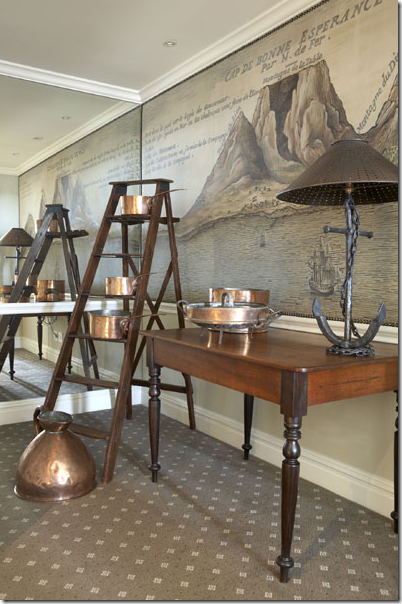
This lobby vignette shows the Cape’s maritime history through the mural of the waterfront and the Cape antiques such as the furniture, the anchor, the copper.
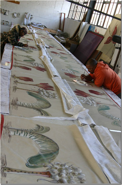
When it came time to chose the fabric for the large project, Weixelbaumer didn’t have to look far – African Sketchbook was located in Cape Town. Their fabrics are all hand painted by artists who are hired locally and then taught the intricacies of fabric making. African Sketchbook is helping the economy by hiring people who would otherwise be unemployed in this country where vast numbers of the lower class struggle financially. With this large project, African Sketchbook set out to create fabrics that would continue the storytelling that the antiques began. The designs are based on the Cape’s history, the trading companies, the porcelains, the spices – its’ all there to be deciphered in the murals and silks. The fabrics became an important part of the hotel’s total design and it is hard to imagine the Cape Grace without these highly unusual, yet haughtily beautiful textiles flowing from windows and spread out on walls.
African Sketchbook was not the only local company that Weixelbaumer employed – she used a blacksmith to create historically accurate metal work and a lighting designer, also from the Cape, who created the one of a kind chandeliers found throughout the hotel. Today, the Cape Grace is enjoying a great resurgence in popularity because of the remodeling. Although it has a reputation of catering to the upper classes (there is a yacht parked out front that is available for rent) it’s prices are such that many travelers can afford its luxury and superb service. For me, though, I would visit for one reason – to examine in person all the antiques and fabrics – what a treat that would be!!
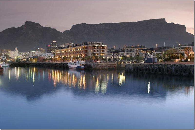
The Cape Grace has a prominent place on the Victoria and Alfred Waterfront, the historical main route of 17th century spice traders.
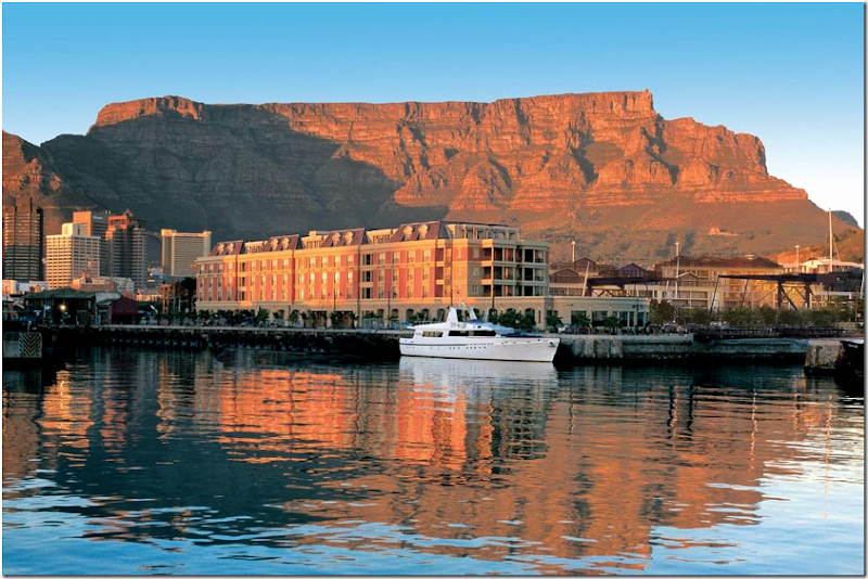
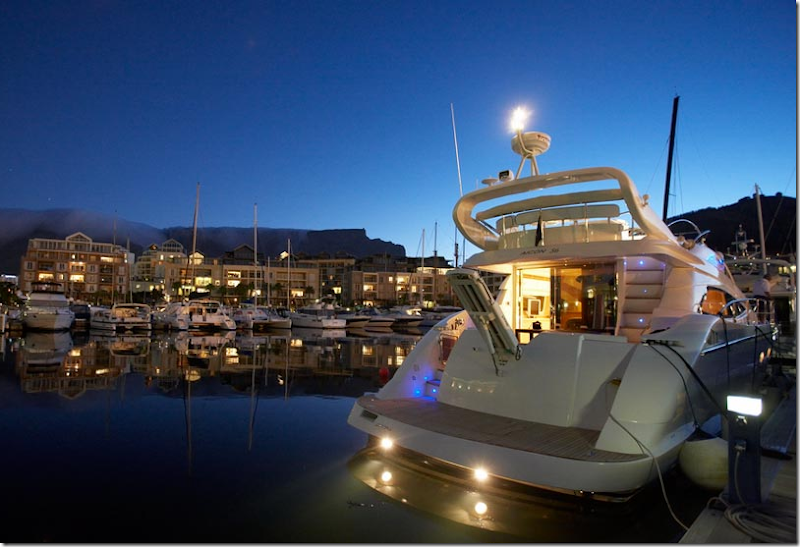
A day view of the hotel with Table Mountain in the background. The hotel’s private yacht is parked outside. The boat’s interiors were also updated!
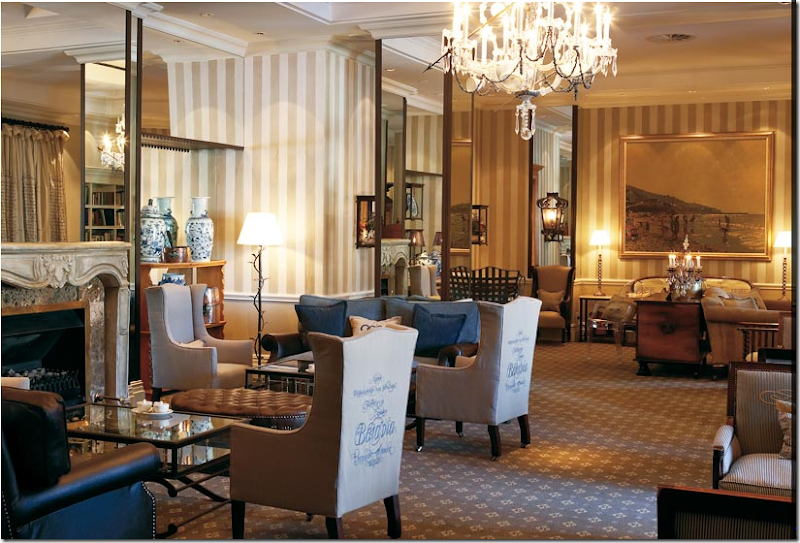
The lobby has much of Weixelbaumer’s design elements on display: the African Sketchbook fabric with script, the wide-striped painted walls, metal furniture, and one of a kind chandeliers. This patterned carpet runs throughout the hotel and into the rooms. The blue and white porcelains displayed here and in many other areas are reminders of the items that were used in trade during the 17 and 18th centuries. The tall wing chairs with the African Sketchbook fabrics are quite distinctive here.
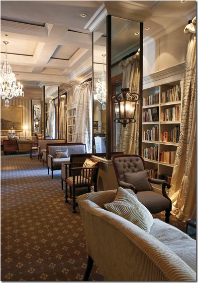
The same room as above, but facing the opposite side, is lined with bookshelves and silk dupioni curtains with beautiful penmanship, telling the story of the Cape’s history. These curtains are fabulous – full and lush. The script adds such a beautiful touch to the fabric.
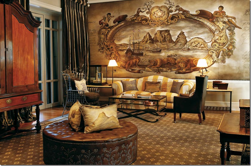
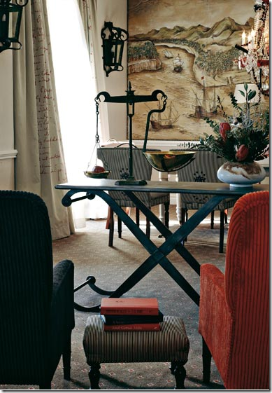
The Fourth Floor Lobby: Antique Cape furniture is featured throughout the Cape Grace. The wall hanging depicts a visual history of the area – hand painted by African Sketchbook. The yellow and white fabric with script continues the striped theme found elsewhere.
A closeup of the beautiful yellow striped fabric and mural depicting the maritime history of the Victoria and Alfred Waterfront.
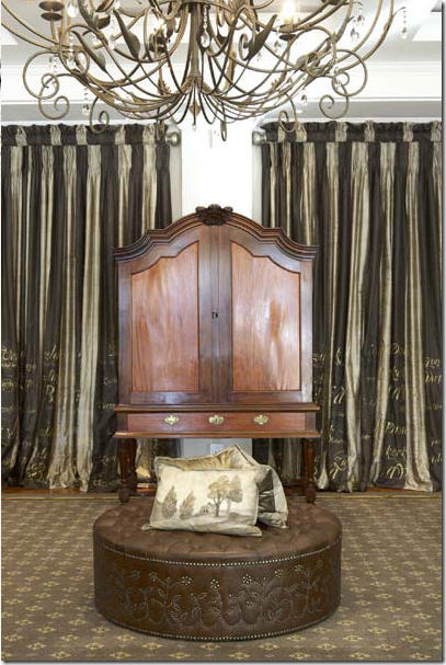
A close up view of the same room, showing the striped silk curtains with hand painted script. I would love to know what the fabric says!
Another corner showing the gorgeous curtain fabric mixed with a complimentary striped fabric. The blue and white porcelains are wonderfully oversized!
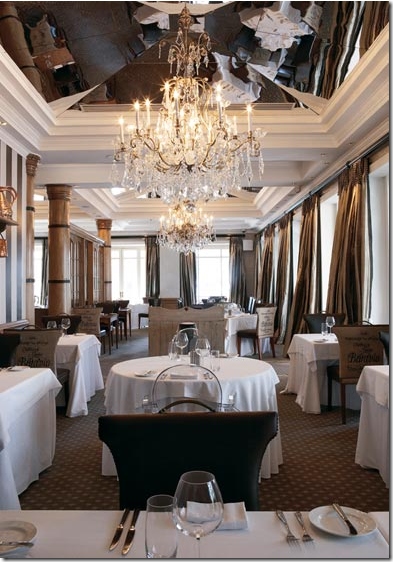
The large main dining room is composed of several separate eating areas. A mirrored ceiling reflects it all. Here some of the chairs are upholstered in a script fabric, while others resemble corsets.
 A closer view of the same area. Notice the curtains – the striped silk fabric that mimics the wall stripes – so lush and beautiful.
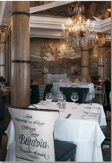
A close up of the main dining room fabric, upholstered on the back of the chairs. A large mural from African Sketchbook is hanging on the back wall.
Copper kitchenware hangs from an antique shelf in front of the striped wall in this area. And here, you can see the corset like upholstery used on these chair backs.
A valuable Cape antique resides in the dining room, in front of another African Sketchbook mural. Contemporary Louis Ghost chairs are mixed in with all the priceless antiques, keeping the decor from being too serious and stuffy. Weixelbaumer, a popular Cape Town interior designer, is known for her busy and cluttered interiors. She is not a minimalist, as the hotel shows!
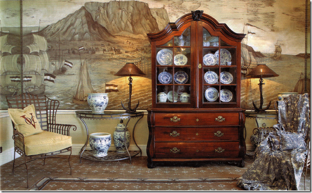 This 18th century cabinet is considered the most valuable item in the hotel’s collection. It stands in front of a beautiful mural depicting the waterfront in Cape Town.
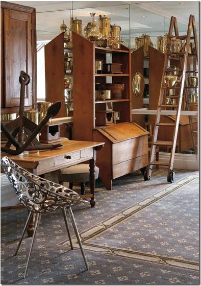
More antiques from Cape Town’s history are displayed here – great ladder!
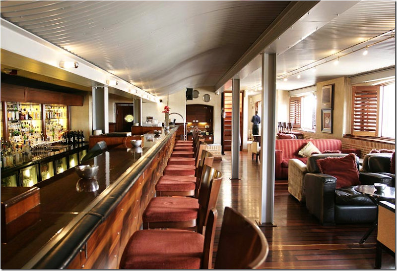 The bar is designed to look like a ship – and it truly does. I love the striped upholstered and the worn leather used together here.
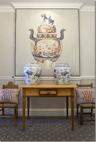
In the Imari lobby (each floor has its own decorated lobby) homage is paid to Japanese Imari, another product traded during the early history of the Cape. African Sketchbook created the drawing of the large piece of Imari.
In one of the suites – another mural by African Sketchbook is used in the dining room. Notice the wonderful curtain fabric used here.
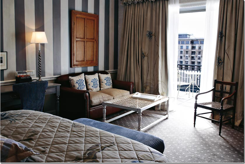 In this room, the African Sketchbook fabric represents the flowers found in Cape Town. More bold stripes on the wall.
This fabric shows the ships from the trading company times. The ships are hand painted on the striped fabric.
Another view of the red striped Maritime themed room. The chest is antique. I love how the curtains throughout are so full and many have a ruffled header – very unusual in a hospitality setting.
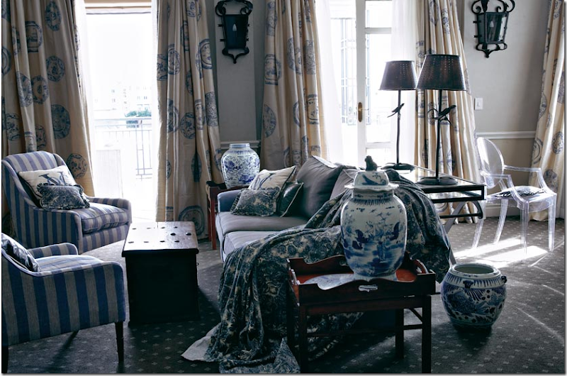
This beautiful suite is furnished in fabrics that represent the blue and white porcelains that were traded during the Dutch East India Company’s time. More blue and white porcelain decorates the room. I adore the striped fabric in the light and dark blues – the same fabric is also made in red stripes. I think this is my favorite suite.
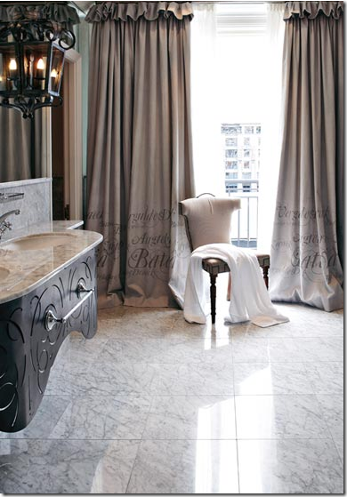 One of the bathrooms with, again, the wonderful curtains with the script hand painted onto the fabric. So unusual, and so beautiful!
Another bathroom, with the same fabric, marble, and a small antique child’s chair. Weixelbaumer said that after she added the antique cupboard and chair to this room – “it instantly started to look different and exciting.” Again, antiques used in hotel rooms like this is highly unusual. It adds such a warm touch and makes the room resemble a home more than a hotel suite.


A view of a standard room, with the antique wakis in front of the bed – the stripes in this room are painted on the headboard.
And another standard room, showing the African Sketchbook fabric depicting the flowers of the Cape. The quilted and studded leather ottoman is a design element repeated throughout the hotel, as are the painted wide-striped walls.
From each room there is a view of either the Table, the large mountain, the waterfront or the marina.
The yacht for private excursion is a much touted feature of the Cape Grace.
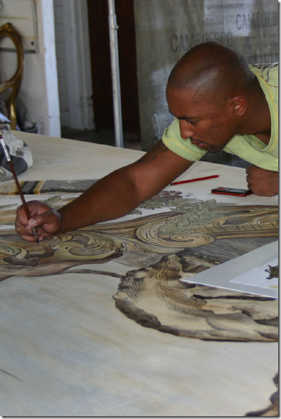
This photo is taken in the Cape Town workroom of African Sketchbook. The artists are seen actually painting on the fabric.
Another picture from the workroom.
I hope you enjoyed seeing these interesting and beautiful fabrics from African Sketchbook. For more information on the fabrics, go to their web site HERE. To order the book, Perfect Curtains, by Stephanie Hoppen, go HERE.
