The House of Luck

I haven't seen the new Sex and the City movie yet because I've read some not so great reviews. I am curious to finally see the fashions and interiors but so much that I feel like giving up two hours of my life just yet. I'm surprised at how much attention has been given to the fact that they shot the movie in Morocco for two months which was used as a stand in for Abu Dhabi. What would have been more interesting is if part of the film actually took place in Morocco and more specifically, in Tangiers, at the former home of Yves Saint Laurent and Pierre Bergé, seen here. It was decorated by the illustrious interior designer Jacques Grange and was for sale last year and might possibly still be available. I can't find any record of it being sold. Perhaps Carrie and the girls could have rented it while getting away from their lives in New York or used it as a pit stop on their way to visit Christian Louboutin on his houseboat on the Nile. Couldn't be any worse than them wearing harem pants in the desert and falling off camels. The house also happens to be named Villa Mabrouka which means House of Luck. Sounds like they could have used some. Enjoy!


Photos by Ivan Terestchenko and Christie’s Great Estates

We Have A Winner!!


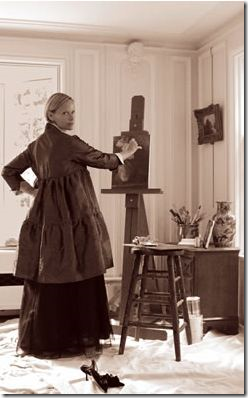
image Patricia Van Essche at her easel.


In one of my most popular giveaways yet, a custom portrait by PVE Design HERE, we now have a winner.  Thank you to all who participated in this giveaway.   And remember, if you really wanted a custom drawing by Patricia, her prices are very, very reasonable, so please consider commissioning her for birthday and  Christmas gifts. 


image The Winner’s Blog:  Loving Every Minute of It (I LOVE this picture – it’s so Texas Hill Country with its fossil laden paths!!)


Our winner is Ariel, who writes a Mommy blog called Loving Every Minute of It HERE.  I am so thrilled she won and couldn’t have picked a more deserving person – she even lives in the Texas Hill Country.   Ariel wants Patricia to draw the 100 year old cottage she lives in with her husband and three sons.    Hopefully, Patricia and Ariel will be willing to share the finished drawing with us!

Congratulations Ariel – and thank you so much Patricia for your generous giveaway.


COMING UP NEXT:   One of the BIGGEST giveaways ever!  I am soooo excited about this.  You will be too – I promise!!!  Details will be coming, very very soon.

CARTELES INDICATIVOS


...................................................................


Una opcion para componer decoraciones rusticas, es colocar carteles indicativos en los ambientes.
La misma tipografia y el modelo de la carteleria le da cierto caracter a la ambientacion incluso puede ser determinante si toma grandes dimensiones.

Estos carteles pueden indicar que ambiente es, o simplemente indicar alguna accion o deseo.

Pero tambien se los utiliza para exponer alguna palabra simpatica o que nos genere sensaciones, alguna palabra con humor ironico o generar sorpresa o recuerdo.
Son muy comunes en el rustico escandinavo.


CALADOS EN MUROS


..............................................................


Los muros rusticos nos permiten interesantes calados que aportan a la funcionalidad de los ambientes.


Los calados en muros son tradicionales en la arquitectura griega y la arquitectura de piedra, tambien son comunes en toda la arquitectura vernacula del Mediterraneo y la arquitectura mexicana..


Imagini Frumoase Animale - Catei si Pisicuta

Catei albi pufosi

ISLAS RUSTICAS PARA LAS COCINAS


...................................................................


Las islas son muy utiles en las cocinas, pero estas islas no son las modernas mesadas sino la clasicas mesas de ubicacion central.

Estas islas son utiles tanto para el guardado de utensillos de cocina como para la preparacion de pequeños menesteres, sus dimensiones son minimas y se adaptan a las tradicionales cocinas amplias con mobiliario en L o en U, para colocar en su centro o como mesas de arrime.


.

Our Giveaway Item Found A Home!!

Remember our Jonathan Adler Misia Vase giveaway last year?? The winner of our vase, Miss Fabulous K, actually lives here in Dallas. Instead of shipping it to her, we decided to do lunch to chat all things blog... as usual, life got in the way! But, we finally got together on Friday and are planning some exciting things for the blog world with a collaboration between Fabulous K & Hello, Splendor. In the meantime, take a look at her giveaway win in it's new home. How lovely?? 

Visit Fabulous K's Design Blog... It's pretty amazing!


CAMA EGG DE LOMME


.....................................................................


Este diseño de cama futurista llamada Egg es producida por la empres francesa Lomme.
Con un diseño poco tradicional y muy innovador propone formas organicas y naturales para el placer del sueño.

Su diseñador es Gunther Thonys, un diseñador varias veces premiado por sus objetos vanguardistas.

Su diseño esta basado en el estudio de los sonidos, las luces y las posiciones durante el sueño, un complejo sistema de leds simula la iluminacion al atardecer y al amanecer recreando estos dos momentos del dia.


.


ORGY, LA LINEA DE SILLONES DE VANGUARDIA

...............................................................


Orgy es la nueva linea del diseñador Karim Rashid, para Effecct, la empresa sueca de mobiliario moderno.
Orgy propone una linea organica y moderna a la vez que,  poseedora de un impacto visual importante en los ambientes que se ubican.

Con sus bordes redondeadas y sus formas naturales hacen de esta linea de mobiliario una propuesta distinta que el tradicional mobiliario.
Sus colores impactactes llaman a las visuales y hacen interesante cualquier interior.


.


Las oficinas de Google en Sydney

Google cree en la creación de entornos de trabajo muy especiales. Tomemos, por ejemplo, su nueva oficina de Sydney.

Déle un vistazo a estas imágenes, y observe que es todo lo que hay. Sea la pared de plantas en la recepción o el campo de cricket en la oficina.


Mira este video donde el diseñador jefe de la oficina de Google en Sydney (Angela Ferguson, de Futurespace) habla sobre el enfoque que tomó durante este proyecto.