Sally Wheat lets me back inside!
One of the most popular stories on my blog has been “Stalking the Wheats” where last year I wrote about a beautiful house that I stalked on my daily Starbucks route. The story of this house, a mixture of Belgian styling with lots of trendy pops, was a huge hit with everyone. Their gray kitchen in particular was admired. Even today, I still get emails asking for the color of Sally’s cabinets (Benjamin Moore’s Fieldstone.) The Wheats’ house did not go unnoticed by people in the media either. Several magazine scouts that read my blog took an immediate interest in the house and finally - it was approved for a photo shoot with Country Home magazine. As we all know, that magazine folded, just shortly before the photographs were to be taken. But, all was not lost. The editor of Houston House and Home, the top local design magazine here, contacted me about photographing the house - which Sally very excitedly agreed to. The photo shoot was set for earlier this summer. The only thing that was particularly nerve wracking about the entire shoot was Linda Barth, the editor, had asked me to write the cover story! YIKES! She promised it would be easy – she wanted a similar story to the original “Stalking the Wheats” – and so I agreed. Most exciting of all, I would actually get paid for writing the story, which is a first – to be sure! Everyone knows blogging is truly a labor of love, we don’t get reimbursed by some big blogging boss out in cyberspace.
The Houston House and Home photo shoot happened over a month ago. I had not been back inside the Wheats’ house since the first story, and I was very pleasantly surprised at all the wonderful changes that have taken place. Sally, like all interior designers, isn’t one to sit by and let her house just “be.” It’s constantly in flux as pieces go in and out and from room to room. The biggest change was in the living room; oh, I almost gasped when I saw it – it was so beautiful. It’s been pure torture to have all these wonderful photographs that I took that day and not to be able to show them, but we (Sally, Linda and I) decided it would be better to have my new pictures timed to come out at the same time that the magazine issue came out. The Houston House and Home with Sally Wheat’s house on the cover arrived in the stores this week, so, today – here are my updated pictures of the house! The magazine is online – if you don’t live in Houston, you’ll still be able to read the story. And for fun, be sure to read my original story here to see what changes Sally has made since we first visited in April of 2008.
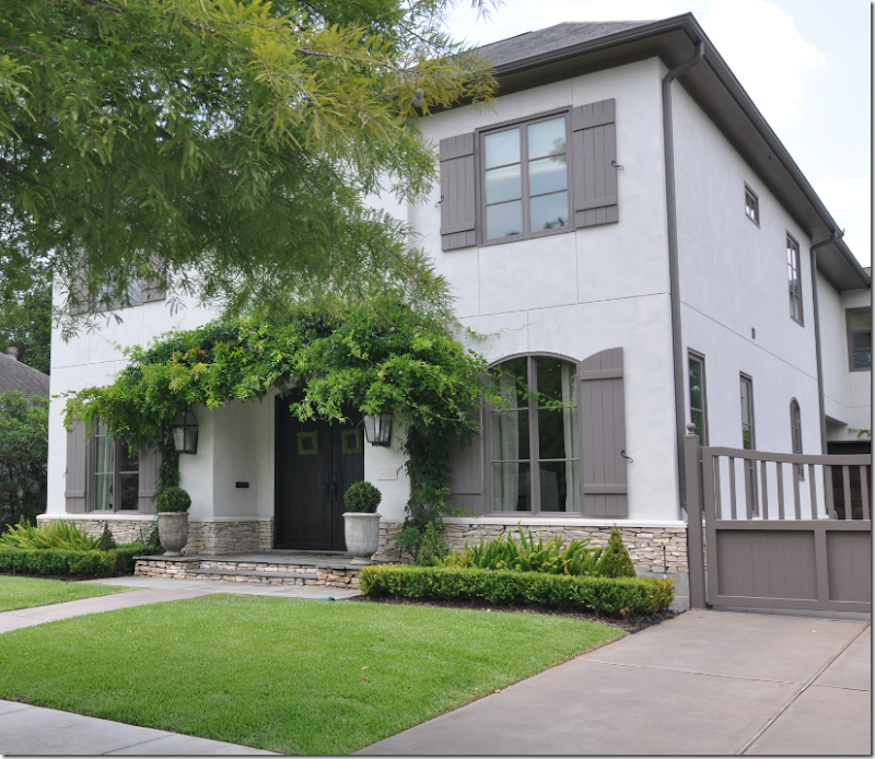
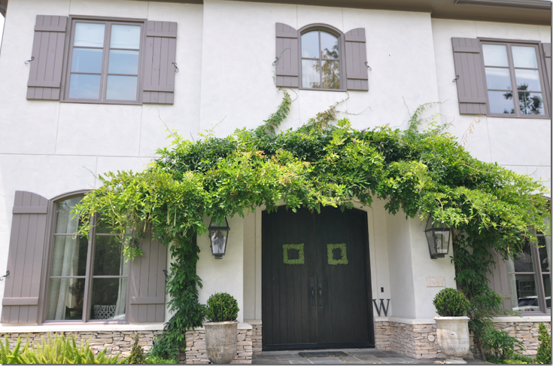 The evergreen wisteria has really grown since last year, but all in all the exterior was same, except for different pots at the front door.
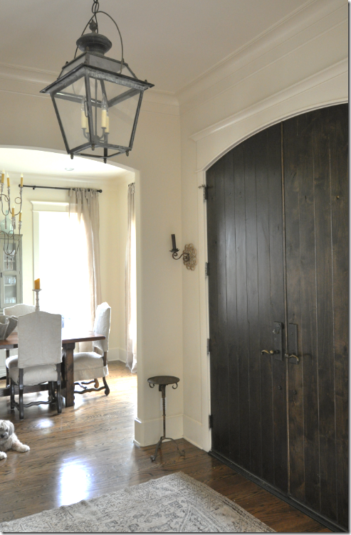
The front door is dark brown planked wood with small sconces flanking it. Above is the lantern from Chateau Domingue.
Sally and I are very different in that she doesn’t like any lights on in her house during the day! I am the complete opposite – I love all my chandeliers blazing all day long and I keep my sconces on 24/7 (after years of fighting with Mr. Slipper Socks Man over this!) Here, I turned on the lantern and the dining room fixture. She really doesn’t like them on – not for electricity issues – she just thinks the house looks better in natural light only. A thought: do you? Which you do like, lights on during the day or off?
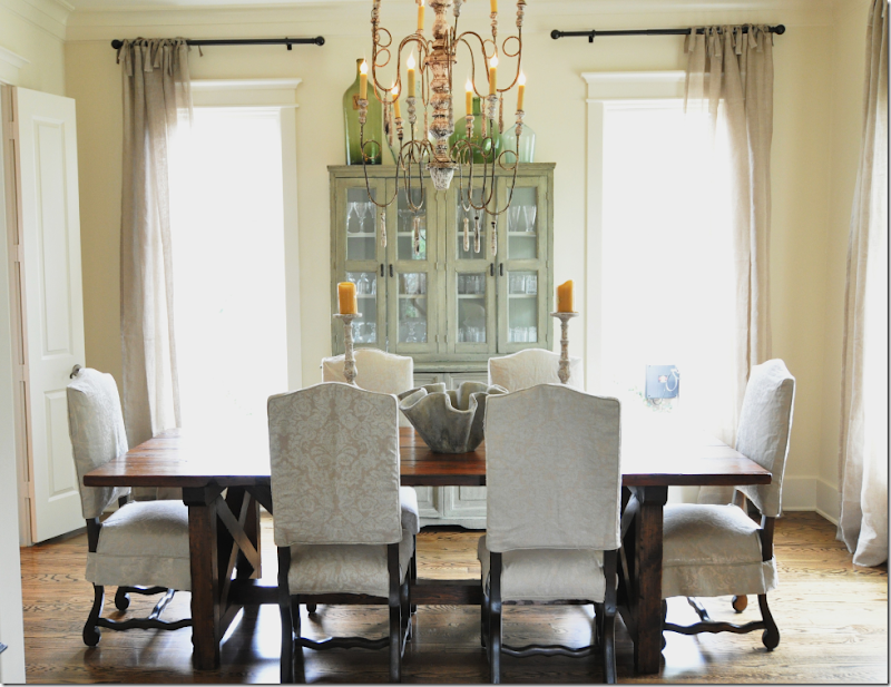
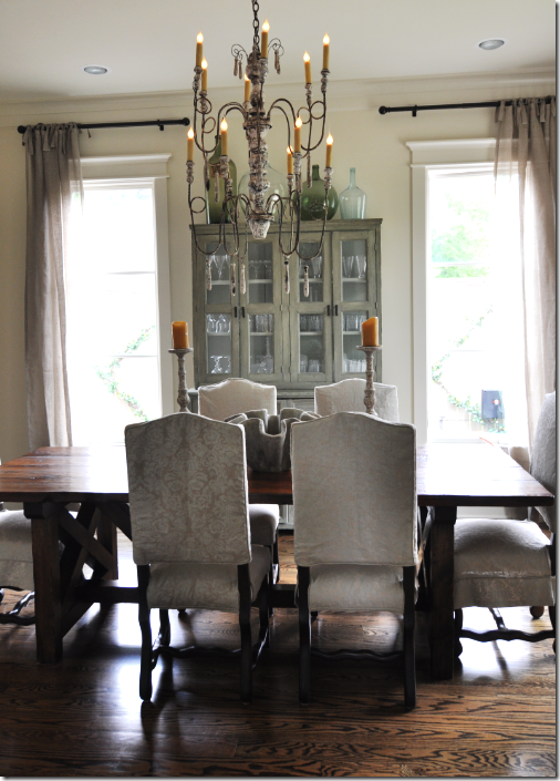
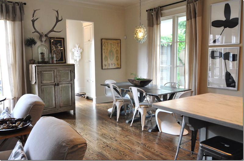
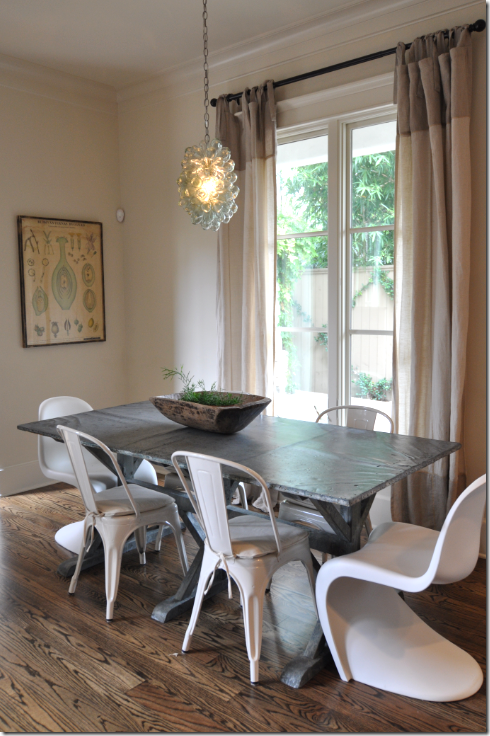
The biggest change in the dining room was the breakfront – it was formerly in the living room. The mirror that was previously where the breakfront is now moved to the living room! Sally had the dining table custom made to match one she had seen in World of Interiors magazine. Os de Mouton chairs are slipcovered in a muted damask. The curtains, from Indulge in Houston, are very breezy and are unlined linen with top ties.
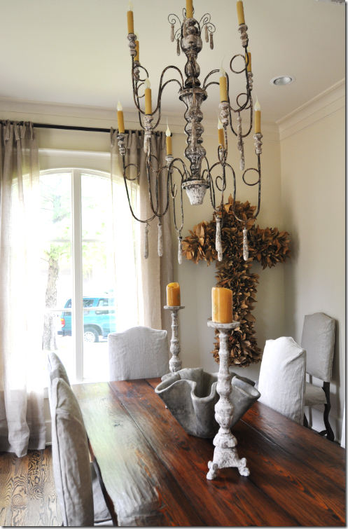 Another new addition to the dining room is the large cross made out of dried leaves. I love her wooden Italian chandelier and her choice of accessories for the table.
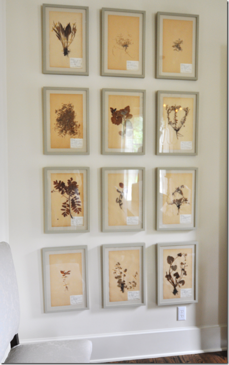 One small wall in the dining room is completely filled with this set of botanicals.
Here you can really fully see the chandelier. The dining room is to the right of the front door, so now, we’ll go the living room at the left of the front door.
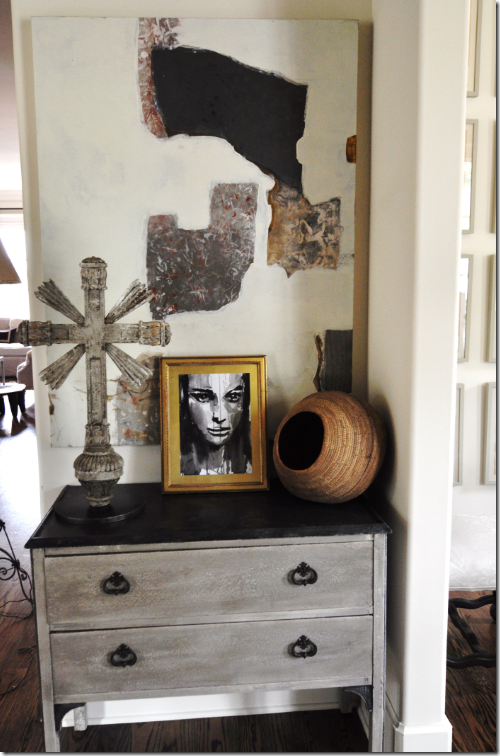 Facing the front door, this vignette is between the living room and dining room and it shows Sally’s style – a mixture of antique and modern.
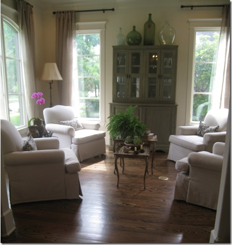
BEFORE: Against the back wall of the living room was this magnificent screen from Thompson Hansen. When I was stalking the Wheats, I could see this screen from my car, and it used to really make me want to go inside and see the rest of the house!
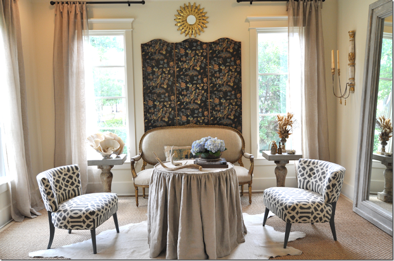 TODAY: C’est magnifique! What a change! I gasped when I first saw this room – it is just beautiful. Sally moved the screen (and removed some extra panels from it) behind an antique gilt framed French settee. She added a linen skirted table and a seagrass rug is layered with a white calf skin on top. Two vintage chairs that are not a pair are covered in Kelly Wearstler’s Imperial Trellis. This setting made the cover of Houston House and Home.
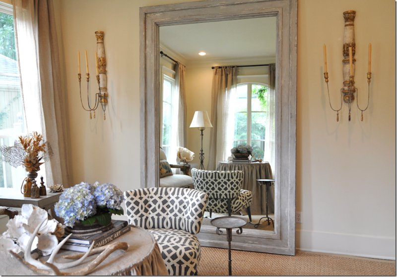
On the right wall is the large mirror that was once in the dining room. It is now flanked by two antique sconces.
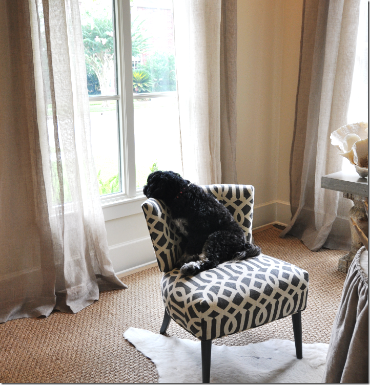
Perfect perch for the pooch!
I love the way the room is reflected in this shot. I hate to leave here! It’s so pretty!
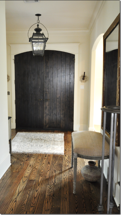 Walking down the center hall to the family room/kitchen, you pass the stairs on the left.
Here we pass the iron stairs that were painted to resemble pewter – next is the family room. This picture is from last year - I forgot to take one of the stairs this time!
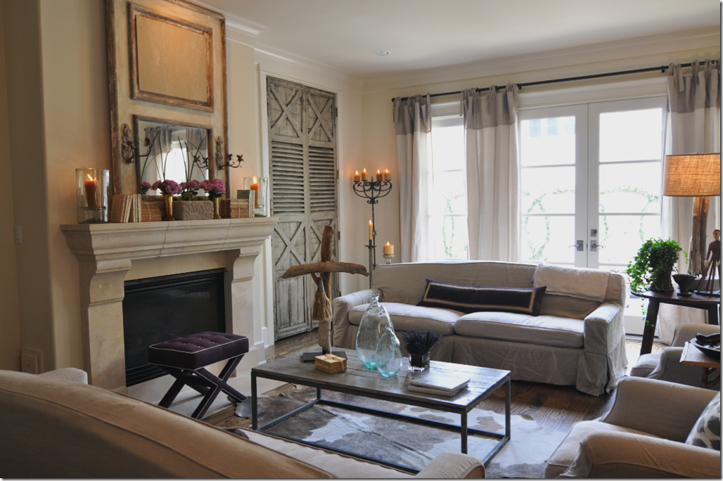
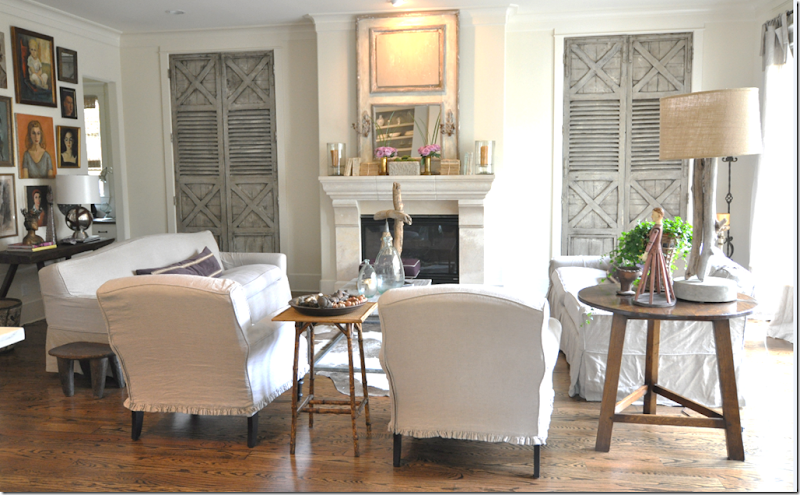
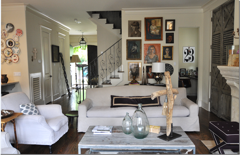
The two matching sofas are slipped in linen, long and lean – Belgian style. There are two armchairs and a cow hide rug underneath.
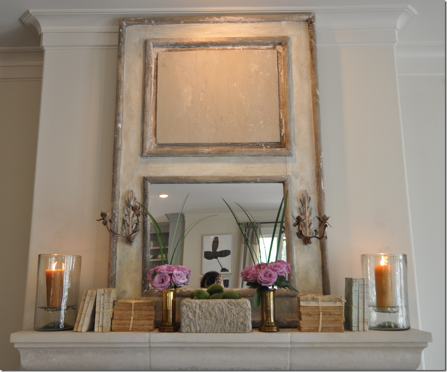
The mantle now has old books – without covers, the trendiest of the trendy, and lilac roses. I think this looks so beautiful! The light above was driving Sally crazy – she couldn’t wait to turn it out. I happen to like it on myself – too funny. Notice moi in the mirror. hehe
Love the coffee table – Sally makes the driftwood art herself with wood she collects at her beach house on Boliver. She sells the items at her antique booth at Antiques and Interiors on Dunlavy here.
The TV hides behind one of the antique shutters Sally bought and had repainted. Originally the house plans called for open shelving here which Sally had changed before the house was completed. The shutters are now the beautiful focal point in the family room.
Behind the sofa on the left are the stairs and the portrait wall – filled with anonymous women – several of whom actually resemble the dark haired Sally! The collection of portraits has grown over the past year.
A wide view of the family room – on the very left is the kitchen and on the very right, under the stairs, is the computer office hideaway. In the hallway by the front door are things being moved around for the photoshoot. Madeline Weinrib pillows on the chairs.
To the right of the family room is the breakfast room and then the kitchen. The doorway leads to the back stairs which go to the playroom.
Closeup of the vignette between the family room and the breakfast room.
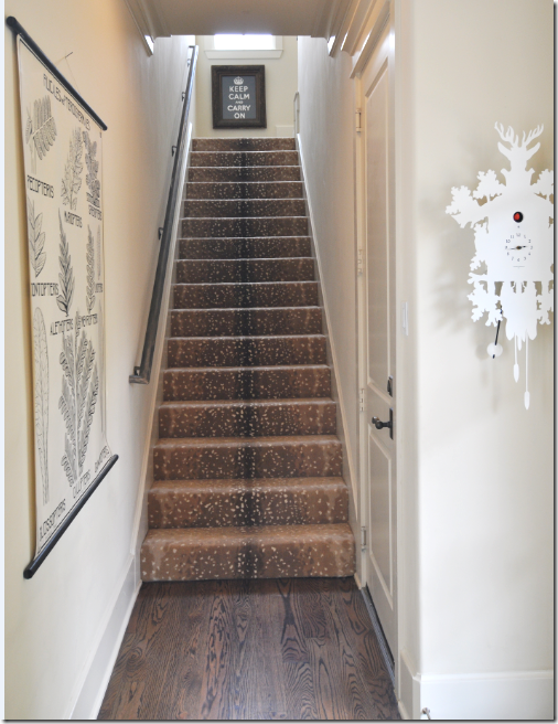 The back stairs up to the playroom. I really like this carpet. Sally loves trends as much as I do – can you count the trends in this picture?
 BEFORE: The breakfast room as it was – French host chairs and an antique chandelier.
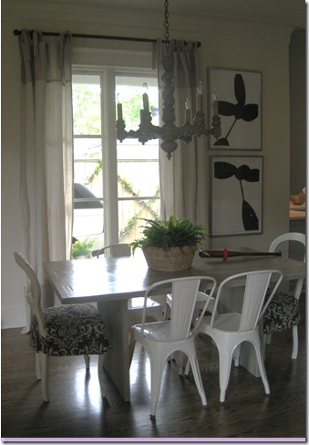
AFTER: Everything has changed except the Tolix side chairs – the zinc table is new as are the Pantone chairs. The lighting fixture was replaced with something more modern from Indulge Maison Decor. Sally loves to mix the new with old, the modern with the antique, the industrial chic with the Belgian chic.
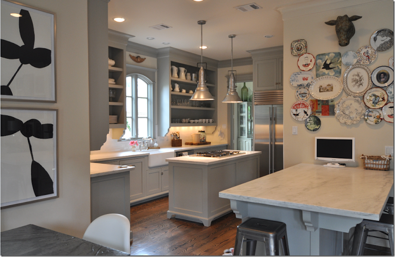
Leading into Sally’s kitchen - the plate wall over the marble buffet is new since last year’s visit.
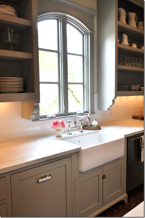
Sally’s kitchen was such a hit last year – everyone loved it! The gray cabinet paint color is Fieldstone by Benjamin Moore. The lighting fixtures came from Brown in Houston – aren’t they fabulous?

I love her casement window and the Shaws sink with the polished nickel faucet. Love her cabinetry and hardware too. Let’s go upstairs now.

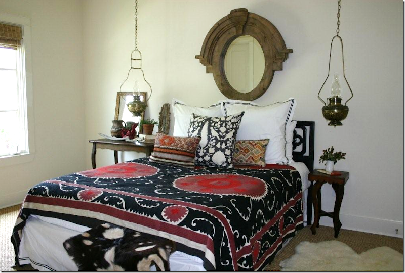 AFTER: The new guest room is all black and red – with a vintage suzani the focal point. I love the hanging lanterns! Upstairs is all wall-to-wall seagrass, my favorite.
Cute side table vignette in the guest room.
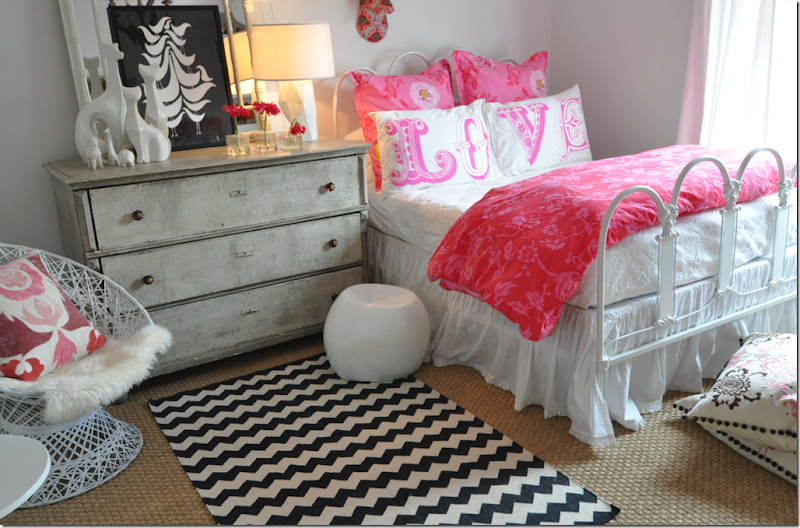
Since last year, Sally has added some new touches to her daughter’s room, like the Madeline Weinrib rug.
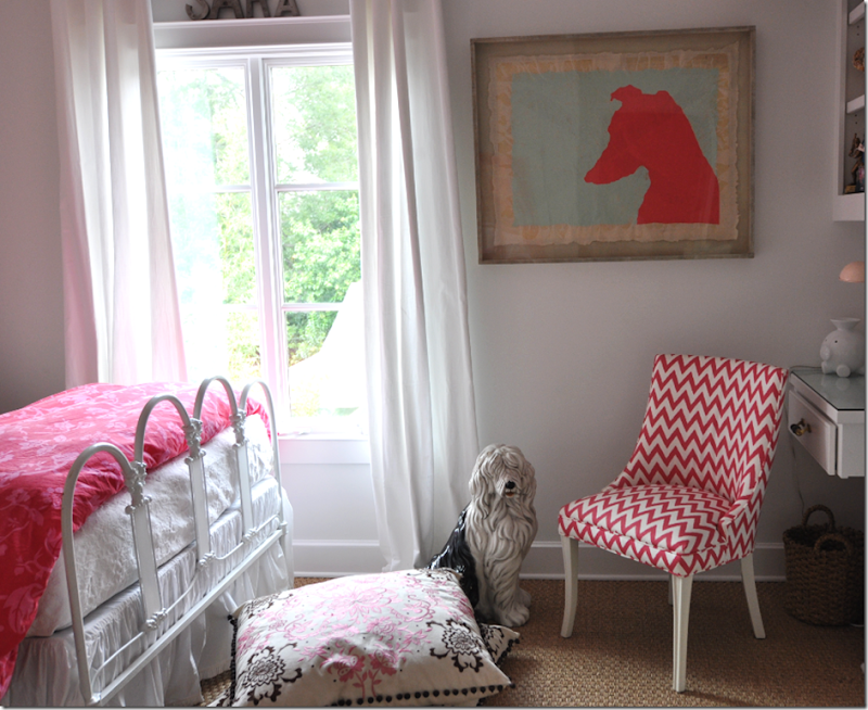
Sara’s vintage chairs wears a Rubie Green fabric, isn’t it the cutest? Sally loves to buy vintage chairs and redo them with paint and fabric.
The master bedroom now has two vintage chairs, slipped in white, in front of a large antique mirror.
Tired puppies from the long day of photoshooting. Large tufted headboard and antique bench.
Against the windows on the right side of the master bedroom is a large white desk and a ghost chair. Unlined linen curtains. For pictures of her bathroom, see the photos from last year.
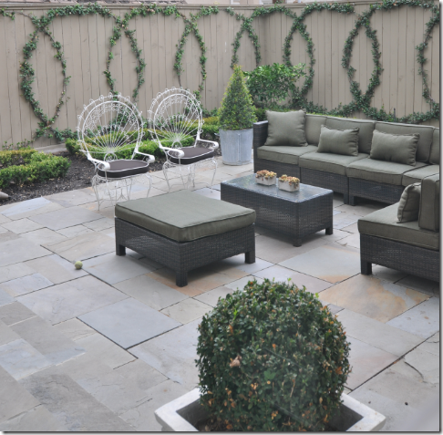 All of Sally’s backyard furniture was damaged in Hurricane Ike, so the back patio is completely new this year!
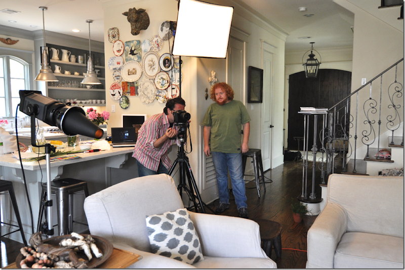
What a photo shoot looks like – the stylist checks the shot while the photographer waits patiently nearby for the OK!! The editor is nowhere in site – probably out looking for the sun. The angle of the sun is important – how the light comes through certain windows can make or break a shot. They were excited to get sunrays in the cover shot of the living room below:
The afternoon sunlight was streaming through the left windows in the cover shot. Really, this is just an excuse to show this picture one more time!!!!!
To read last year’s Stalking the Wheats, go here. And to read the story about Sally’s house in Houston House and Home online, go here. If you live in Houston, be sure to pick up the magazine this month. And if you would like to learn more about moi, read the Editor’s Note – on page 8 – online too. Linda Barth has always been extremely nice to me and I want to sincerely thank her so much for her support and confidence in this little blogger. And a huge thank you to Sally Wheat for all your hospitality and friendship!
