The family room then.
A few months ago I showed you a project I was working on – The Tanglewood House. The clients were living in an older house in one of the nicest neighborhoods in Houston. The debate was whether to tear down the house and rebuild on their lot OR completely gut and remodel. In the end they compromised and did a smaller remodeling job than originally planned, with their sights set on perhaps rebuilding sometimes in the future. I was first contacted by the client, a reader of Cote de Texas, to help pick out finishes for phase one – a gut job of their master bathroom. Out of the space, a new master bathroom was created, along with a new powder room. As work went on, the job got larger, as is always the case. First we would do a minor redecorating of the master bedroom, along with a minor redecorating of the family room. Much work was also to be done outside. In the end – a new roof was put on, outdated dormer windows were replaced, the facade was painted, new shutters were built, new landscaping was installed along with new gates, and on and on. Inside, all the doors were replaced and painted black to give them some presence, and new hardware was purchased. Most of the inside of the house was painted. Plans to restain all the wood floors were put on hold until this summer.
In the family room – we purchased all new furniture, covered with pricey fabrics. Also, a large built in was designed to hide two computer desks for the children. We added woven shades and curtains at the French doors, along with a large seagrass rug. All new accessories were purchased to fill the many added shelves. In short, the minor redecorating job had turned major – as is always the case. The clients’ initial budget was increased too many times to count. When the family room was completed, the clients were very pleased with the results. The furniture arrangement worked perfectly for their TV watching and the new computer desks were functional and in use, day and night. Extra meals were eaten on the gate leg table that doubled as a work space. All in all – everything was wonderful. Except for one thing – well, two things exactly: the living room and the dining room. Both rooms were still as dated as the family room had once been, and with that room now looking so fresh, the front rooms looked even more tired by comparison. Added to this was the fact that I had robbed the living room of two club chairs to be used in the master bedroom redo.
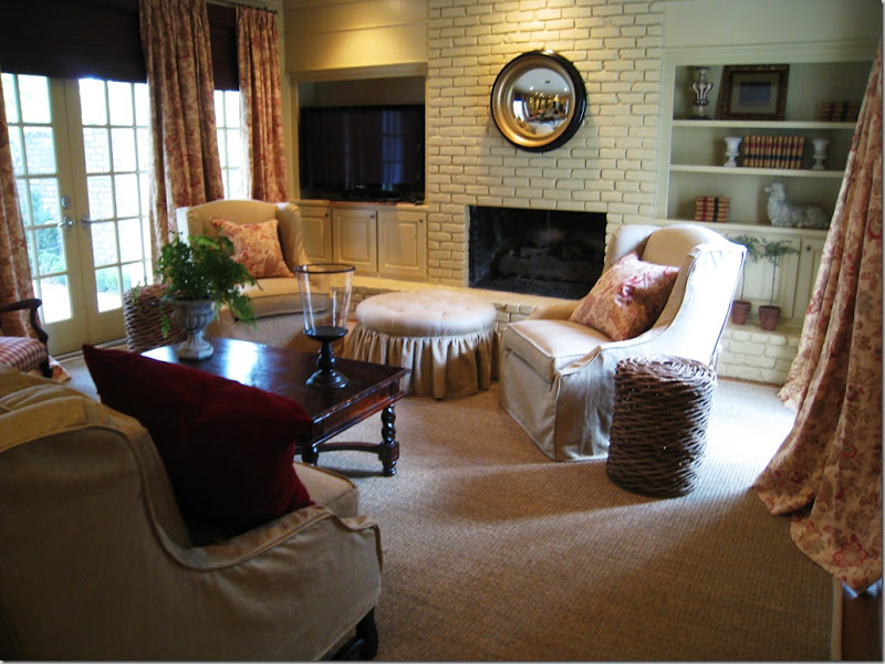 The two new arm chairs swivel for easy TV watching in the family room.
My client, the wife, knew that something had to be done to freshen up the front rooms and quickly – the eldest son was graduating and out-of-town family was arriving for a weekend of celebration. In the middle of April, she asked me – could we possibly redo the two rooms, by graduation day in four weeks? And could we keep to a strict budget – pretend we were on some HGTV Makeover Show where an entire house is transformed for $500 in 24 hours? Sure – no problem!!!
Actually, I liked the challenge. I knew if we worked fast, used what she already owned, picked out reasonably priced fabrics, paid a rush fee to the upholsterer, and bribed Monica – my partner who facilitates all the soft goods – that we might possibly be able to transform the two rooms in a few weeks time, bringing them more in line with the already updated family room. Miracles do happen, don’t they? Here is what we had to work with:
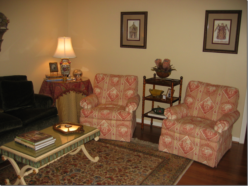
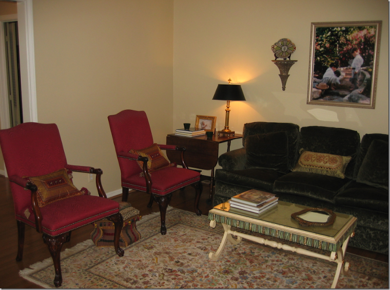 Living Room Before: There was a nice sofa, in a green velvet and two English styled chairs.

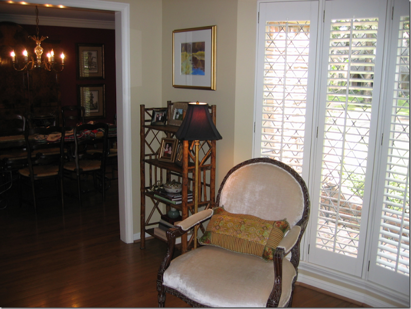 Facing the sofa was a pair of French styled chairs covered in velvet. A bay window – with shutters – lets in the only light in the room and to top that – it’s a northern exposure, which means the room sits in a dark shadow 24/7.
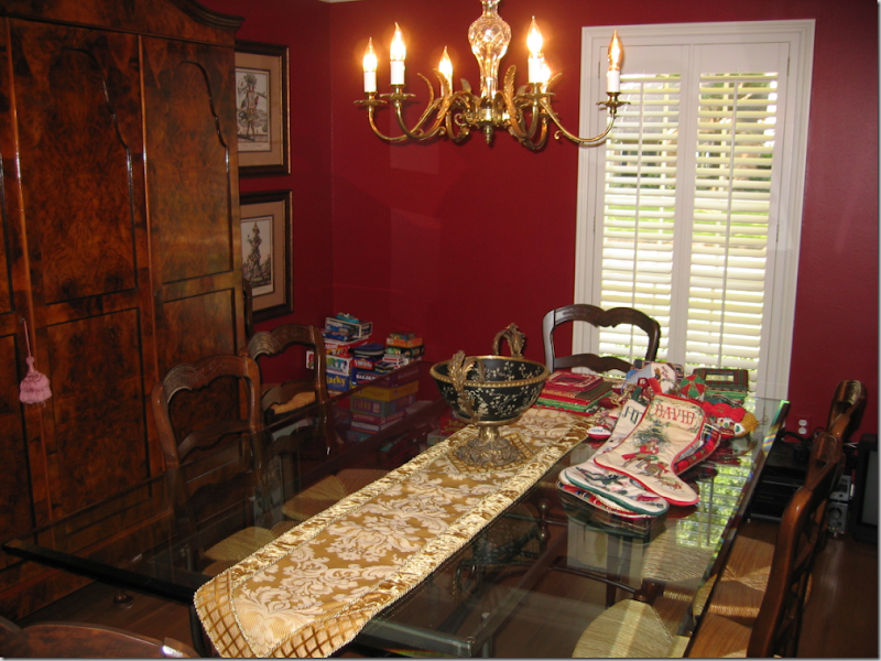 The dining room was painted red, so chic ten years ago. The table was beautiful – a metal, baker’s table style base with a glass top paired with typical French rush seat chairs. There was a gorgeous antique armoire in the dining room that stored all the china. The small window, like the adjoining living room, had plantation shutters and, again, a northern exposure.
The plan: everything would be slipcovered. The floors in both rooms would get large, custom cut seagrass rugs to unify them. Both rooms would be painted in a rich, dark caramel color that would blend with the family room. The three cushioned sofa would be remade with one bottom cushion and two back cushions only. Curtains would be fashioned alike for both rooms to tie them together. A new, larger dining room light fixture would be purchased. A mirror from the old master bathroom would be painted antique gold. A collection of antique egg prints would be framed. All the small accessories, lamps, tables, and what-nots would be sold. There was one end table and one trunk that we would re-use. The only piece of furniture we would buy would be a new coffee table and we would add a larger skirted table.
Since everything was getting slipcovers except for the two red English chairs, keeping fabric costs down was imperative. White linen can be one of the most expensive or cheapest fabrics you can buy, depending on where it’s made. And white linen is also one of the best looking fabrics there is. I found some at Glicks for $16. a yard! Pindler and Pindler came through with an Ikat and a printed cotton for just pennies more. In fact, the fabrics were so inexpensive, yet still trendy and up to date – they were the deciding factor in getting the green light for the entire project. The amount of yardage needed was large and if we had chosen something in the price range of even $25 a yard – the whole redecorating job would probably not have taken place. By choosing great looking, yet inexpensive fabrics, the price tag was very reasonable.
And so, my client and I tallied up all the expenses, the guesstimates and estimates of what is was going to take to totally transform these two rooms. She presented her husband with the figures and we waited for his final approval, knowing that the deadline of the graduation festivities was fast approaching. About a week later, I got the phone call that all was ok-ed by the “big boss” (thank you Mr. P.!!!!) and I ordered all the fabric to be shipped overnight. Here is what the two rooms look like, just a few weeks later:
NOTE: open your browser to full screen to see the photos at proper size. Thanks!!!!
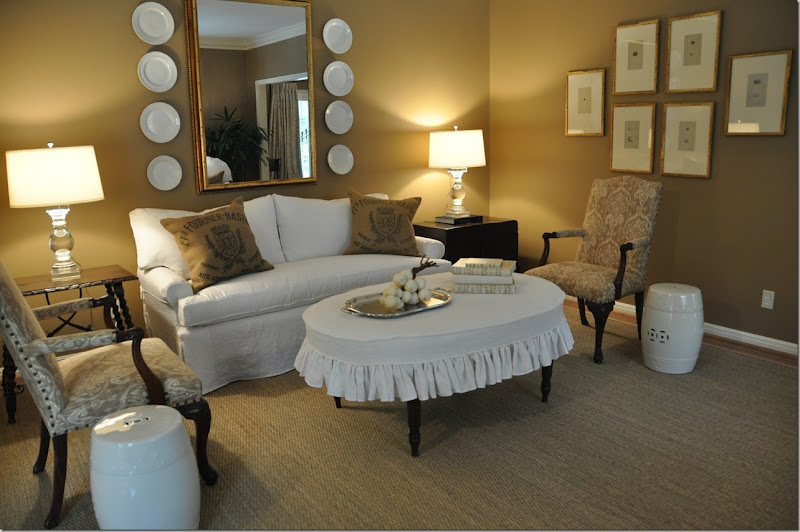
The living room today.
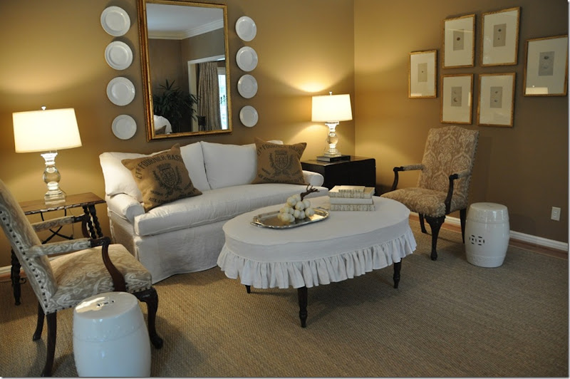
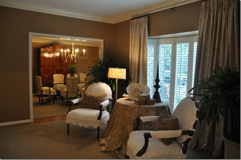
The green velvet sofa was upholstered in muslin, then slipped in white linen. The three cushions became one bottom and two backs for a trendier, more up-to-date look. The red English-styled chairs were upholstered in the Pindler and Pindler Ikat fabric with an exaggerated nail-head detailing. A large mirror was repainted in an antiqued Italian gold and surrounded by white ironstone, picked up at The Gray Door at the Urban Market. White garden stools from Wisteria double as side tables. The oval coffee table, the only piece of furniture bought for the room, was slipped in the white linen. A large seagrass rug was custom cut a few inches from the walls, which were painted a rich caramel color. For side tables, we used an existing Spanish styled, dark walnut stained table, and an Oriental, black trunk on a frame. The crystal lamps are from Restoration Hardware.
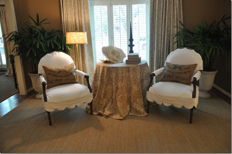
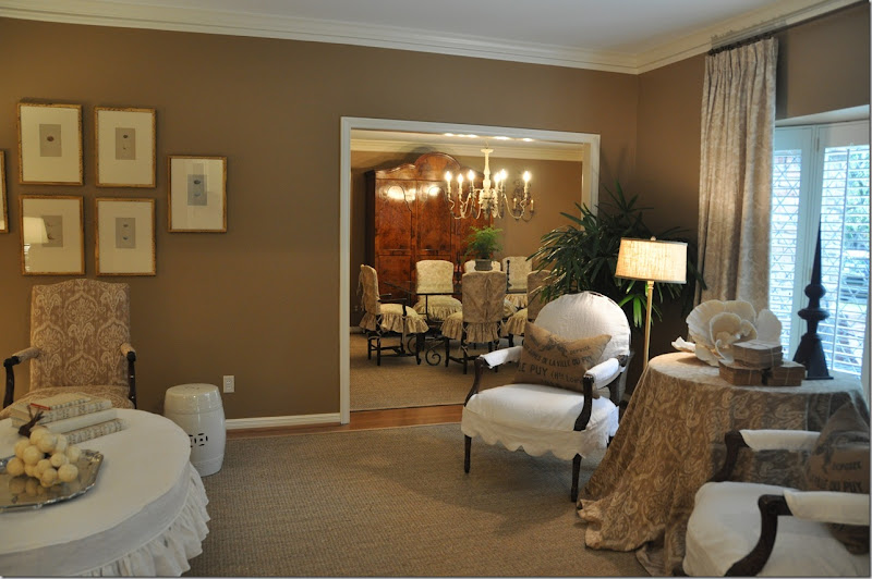
Facing the sofa is a large skirted table, topped by the Ikat fabric. The two French styled chairs were slipped with a large scalloped detailing in the white linen. The other Pindler and Pindler fabric, a cotton print, was used for the curtains. Two large urns from The Garden Gate were planted with palms that thrive in low light interiors.


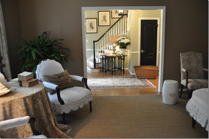 The view facing the entry hall. In the entry hall, we painted the banister black to match all the new doors which were also painted black. An antique gate-leg table was placed there along with four botanicals moved from the master bedroom, now with new ivory mats and newly painted black frames.

Accessory Details:
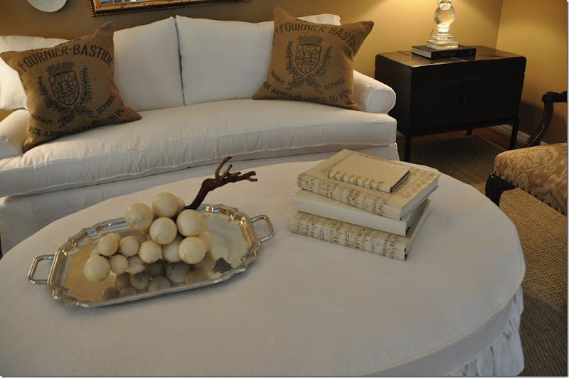
Old alabaster grapes and books covered in music paper accessorize the coffee table. The piece de resistance of the entire room, to me, is the serendipity of the burlap feed bags. The feed bags were originally purchased on Ebay and made into pillows for my own house. I decided the pillows didn’t look good on my sofa, so they went into the no-man’s land of my garage. For my client’s living room, I had ordered pillows made out of the Ikat fabric. On the way to the installation, at the last minute, I grabbed the feed bag pillows just in case they might look good in the living room. Once the white slipcovered furniture arrived, there was no question in my mind that the feed bag pillows would look spectacular – and in the end, they actually “make the room.” The Ikat pillows? The upholsterer forgot to make them. Sometimes things work out in ways you never planned or ever imagined! I would like to say these pillows were specified from day one, and perhaps I should!
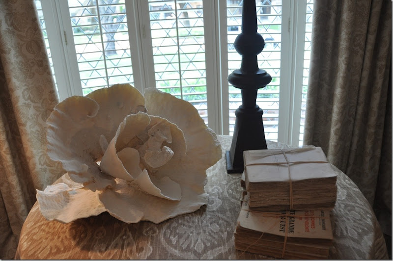
On the skirted table, I used a coral rose I had bought for the client at Urban Market, along with some trendy antique spine-less books from Antiques and Interiors on Dunlavy. At Olivine, I picked up the metal finial in a rusty finish.
Since the two rooms are connected, it was important that they flow visually. To achieve this continuity – the walls in both rooms were painted the same caramel color and both rooms have seagrass matting. Also, the curtains in both rooms are identical.
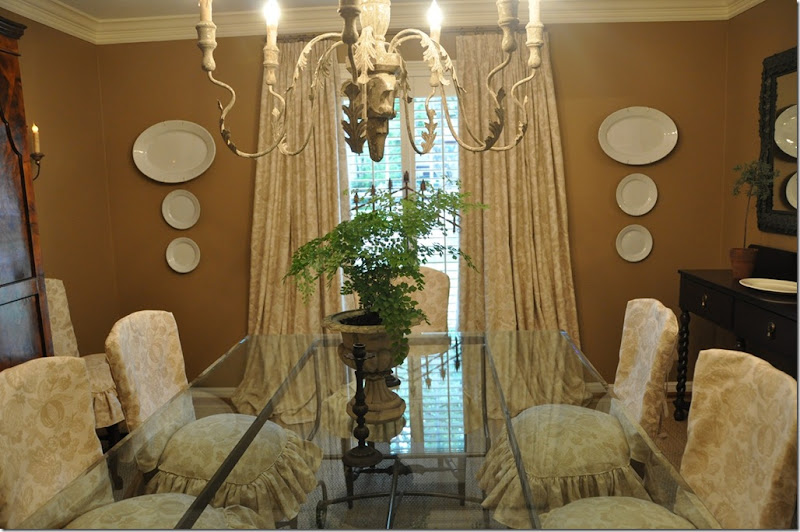
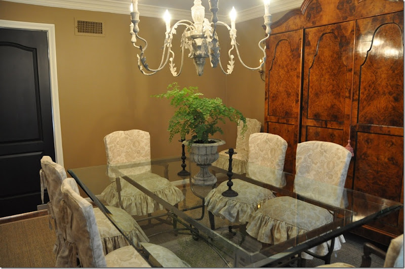
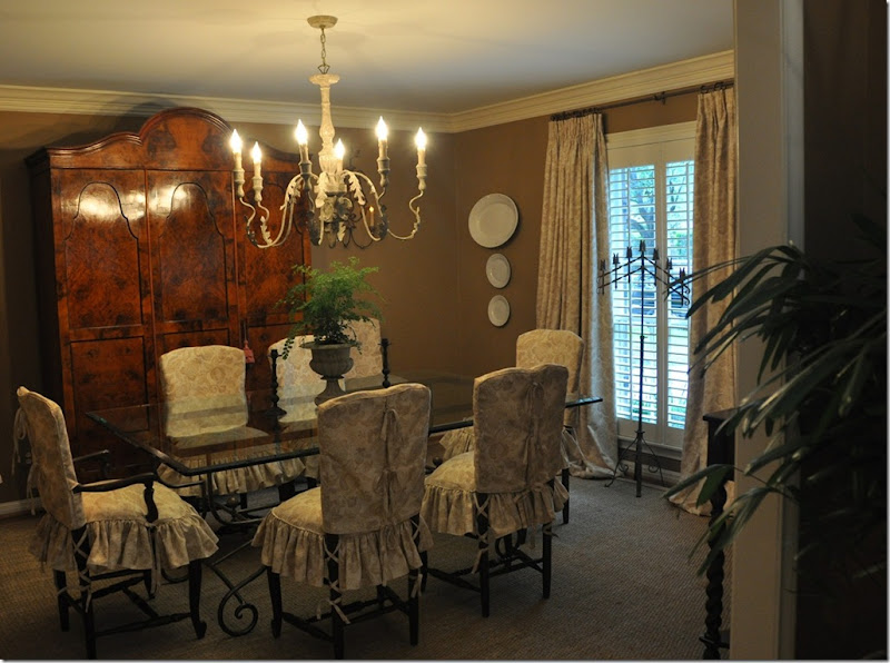 The Pindler and Pindler print was used for both the curtains and chair slips. The large chandelier comes from Aidan Gray. The gorgeous burled wood armoire is the focal point in the room.
Facing the window. The curtains, made identically to the living room, help to connect the two rooms together visually and also soften the room. By hanging the curtains right under the molding and out past the window’s sides – the window actually appears larger. Additional ironstone plates and platters purchased from The Gray Door at Urban Market pop against the deep caramel walls and further tie the living room and dining room together.
And the view to the butler’s pantry, onto the kitchen.
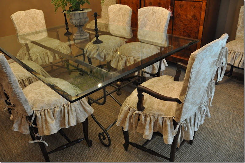
A close up of the slip covers. The slips come in two pieces. The top piece has ties that run down the middle of the chair’s back. The bottom piece has a down cushion built into it to make the chairs more shapely and luxurious looking. A skirt with double ruffles is attached to the cushion. Ballet slipper ties run down the back legs for extra detailing. The client and I have discussed one day replacing the glass top with a piece of stone – yes/no/maybe?
Let’s take one more look back at where we started four weeks ago:
The living room with an area rug, green velvet sofa and red chairs. Certainly nice – certainly pretty, but ready for an update after a decade’s time.
Once the club chairs moved to the bedroom, the living room needed a change.
A few weeks later, the same room with the same furniture and just a few new accessories and rug.
The dining room – painted red, with a too small chandelier, no curtains and bare dining room chairs. Again – very nice, very pretty, but ready for a freshening up.
The dining room today – flowing into the living room – creating a cohesive look between the two rooms. The dining room’s slipped chairs soften all the hard edges, making the room warmer and cozier. The larger chandelier is more in scale with the armoire and the curtains add additional softness to the room.
I hope you’ve enjoyed reading Chapter II of The Tanglewood Redo. And I hope I have shown you how much change can be accomplished with a little paint and a little (well – a lot) of fabric. Another important key to successful redecorating is editing. These rooms were filled with numerous small tables, lamps, art work, and accessories – all built up over the years. By clearing it all out and using just a few key pieces, what is left became more visually attractive. And, most important to remember when redecorating - you don’t always have to start all over. Consider what you have and how you can reuse it. Just by making slipcovers and reupholstering two chairs – we were able to achieve a totally different look.
Look for this house’s master bedroom and bathroom, and powder room remodeling in the next few weeks! To read the original Tanglewood Redo story, please go here.


