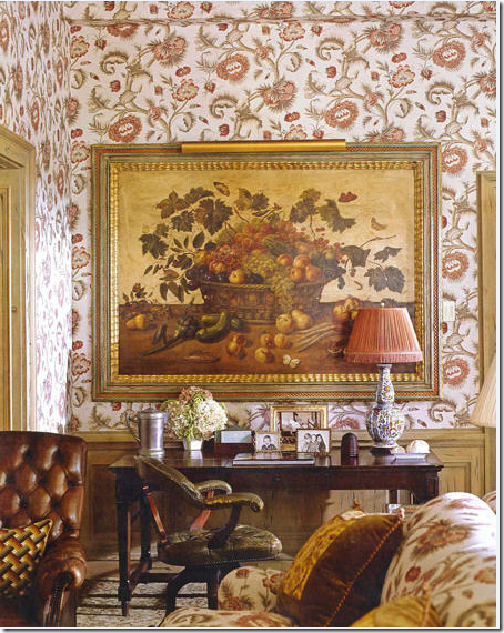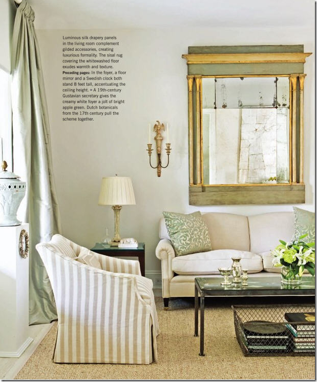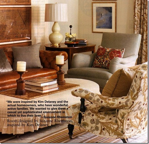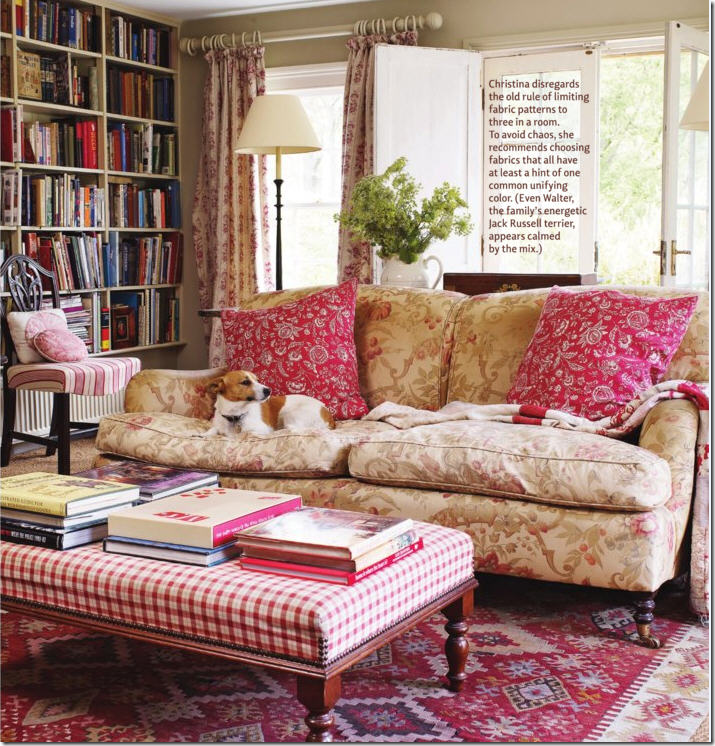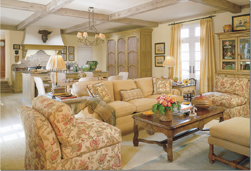
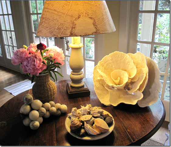
 My trend alert table: coral, no longer red, but trendy big and white, and alabaster marbles – fast becoming passé. Shells are so out, they are in.
Today, we all read the five or six design magazines left standing, and we see the same things photographed over and over and over again, until we collectively say “ENOUGH!” No more coral! No more suzanis! No more sunburst mirrors! No more (insert your favorite trend to hate here.) Yet, I like my suzanis. Every time I see another Top Ten list that tells me “ENOUGH SUZANI” – it makes me doubt myself. Why? What do I care if magazine editors or other bloggers say suzanis are overdone. They ARE overdone – in magazines, that is, but not in real life. Let me prove my point – quickly name me two not-in-the-design-business friends of yours who actually know what a suzani is. I said quickly. The truth is, most, if not all of my friends wouldn’t know a suzani from a lazy Susan. Yet the design aficionados, tired of seeing them in every single magazine for the past two years, have decreed suzanis are out and probably will be the #1 dreaded trendy item on every Top Ten What’s Out list this year. Well, shoot me, I still like them. And I still like coral, though I don’t care for red coral on wood pedestals or stamped on my toilet paper. And anyway, all my coral is white, thank you very much. And no, I don’t have any deer heads, faux or real. But I do have the marble grapes. Like I said, shoot me. Maybe I don’t want to see suzani’s in every design magazine I read, but I DO love seeing it on my bed each night.
My suzani is staying and so is the sunburst mirror – and I don’t care who reports me to the Top Ten List of What’s Out writers!
So, if the Top Ten Lists of Overdone, Over-Exposed Design Elements seems to be targeting my personal taste and my house, why not put out my own Top Ten List of FAVORITE Design Elements? What are the things that I see in a house that make my heart skip a beat? What items cause me to go green with envy when I see them in someone else’s house? What are the 10 items that I think together create a wonderful place to live? There are dozens, if not hundreds of things I adore, yet there is a short list of elements I consider vital to an interior for me to like it. And please understand, I can appreciate houses that don’t fit into my Top Ten ideal. I can even love a house where all the furniture is covered in chenille and the flooring is wall to wall carpet. But my TOP TEN list is the things I design with, the choices I make over and over again because I like them. So, now, in no particular order, my Top Ten List. Note: I will post one or two items from the list at a time. This way, I can really explore each item and explain it’s appeal and really drag this out for a while! Hopefully though, I will finish this Top Ten Series quickly, as opposed to the Top Ten Designers list that still has two left to go!!!!
COTE DE TEXAS: TOP TEN DESIGN ELEMENTS
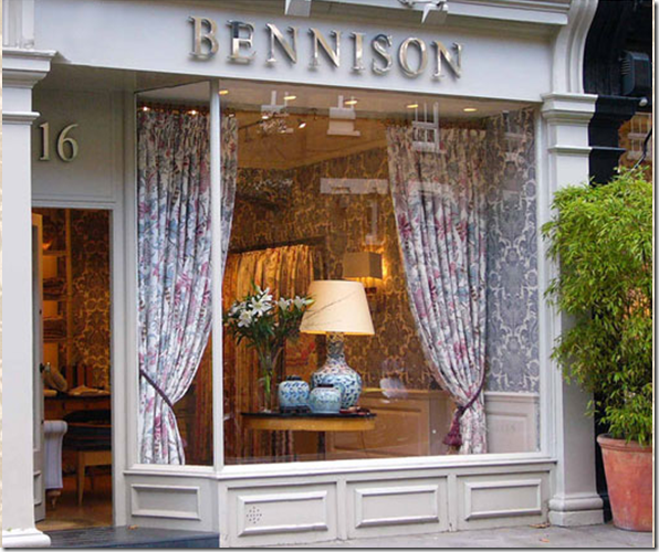
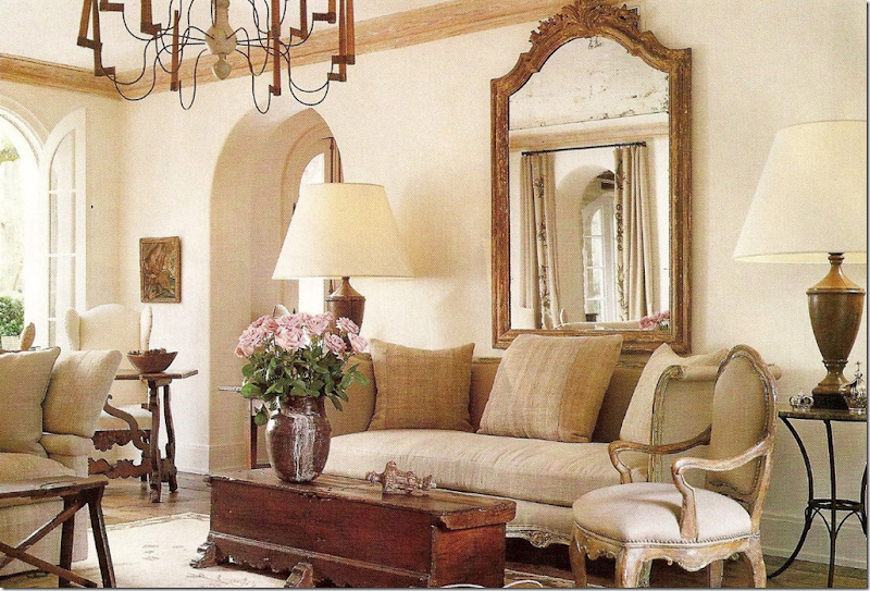
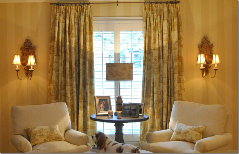
1. LINEN: Show me a house with linen, and I’ll love it. Period. I love both solid and patterned linen – especially patterned linen that is faded and soft from age. I love Belgian and Irish linen – that thick, heavy, rough kind of linen. I love linen with a strong, visible weave. I also love soft linen that is almost see through. The truth is – almost any linen will do and sometimes the least expensive linen is the best! I love linen – in my house and on my body. It’s my favorite fabric – it’s the one that I instinctively reach for when given a choice. I know it wrinkles, but that’s one of its appeals – it’s casual and unpretentious. I probably love white linen the best. But I also go weak in the knees over gorgeous, soft seafoam colored linen or a sweet apricot and dusty pink. I love a glazed linen – Rogers and Goffigon makes gorgeous solid glazed linens. But tea-stained and muted patterned linens are intoxicating. Lee Jofa showrooms, with all their linen prints, can hold my interest for hours. And nothing is prettier than hand blocked linen from Bennison or Robert Kime– though ultra expensive, it’s worth every penny and the wait while you save up for it. Nothing, nothing looks better than a sofa or chair slipcovered with Bennison linen. Just saying the name Bennison or seeing it written thrills me.
Bennison in London. Just the name alone makes my heart flutter and conjures up all the reasons why I love design so much!
In Los Angeles a few years ago, visiting the Bennison shop, I loitered there like a wino waiting for a handout, drunk on all the exquisite beauty. I gently touched each sample – some I had never seen in Houston before. The woman running the shop was pleasant and very quiet. A male friend waited with her, quite talkative – telling me stories of his grown children. We talked and talked for over an hour – any excuse for me to linger longer. The elderly couple were charming and from England and were quite understatedly dressed to be working with such expensive merchandise. The two were certainly not the usual young fashion plates that one finds in the more upscale showrooms. They looked more like they couldn’t afford a yard of Bennison, nor even want any. They were both so down to earth and unaffected.
They were also the owners of Bennison, filling in for a vacationing employee!! To say I was star struck when they finally admitted they were Gilly and Geoffrey Newberry would be a huge understatement. I walked on clouds for the rest of my trip! Imagine waltzing into Stark and being assisted by the owners or the designers. Right, it’s not going to happen. On that trip, we ate at the Ivy several times to catch a glimpse of stars, but I could not have cared less. I had already spent a hour with the two biggest stars in my book!
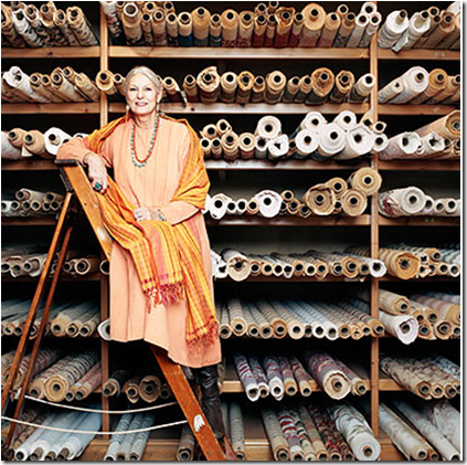
Gilly Newberry, looking quite glamorous here, became the sole owner after Geoffrey Bennison died. Bennison is famous for bringing back centuries old patterns that were long forgotten until rediscovered by both Newberry and Bennison.
What IS it about linen that makes a house so welcoming? Perhaps because it’s organic, a natural fabric, and like cotton and silk, it’s been around for ages. The imperfection of the fabric – the wrinkling, the irregular weave – certainly makes it more casual – and casual is so welcoming. Or maybe it’s the simple quality of the fabric that helps make a home cozy and inviting – two desirable traits. It’s not a dressy fabric, yet pair white linen with deep chocolate velvet and suddenly the opulence level goes way up. Regardless of how it’s used, whether it’s made into curtains or slipcovers, linen is always essential to my aesthetic.
I live with and wear white linen. This linen, from Duralee is quite inexpensive, yet it’s heaviness, thickness and obvious weave makes it resemble pricier Irish linen from Travers!
Houston interior decorator Carol Glasser mostly used one pattern, Bennison Roses, in her former bedroom. The room remained unchanged throughout the entire time she lived there. Why mess with perfection?
Houston designer Pam Pierce’s living room. The simple fabric dresses down the exquisite French antiques.
In this study for a client, I used Bennison for the curtains and pillows and seafoam Rogers and Goffigon linen for the sofa– two of my favorites!
Simple white linen pops against the richness of all the antiques and pricey art work – design by Axel Vervoordt.
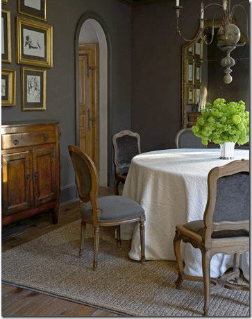
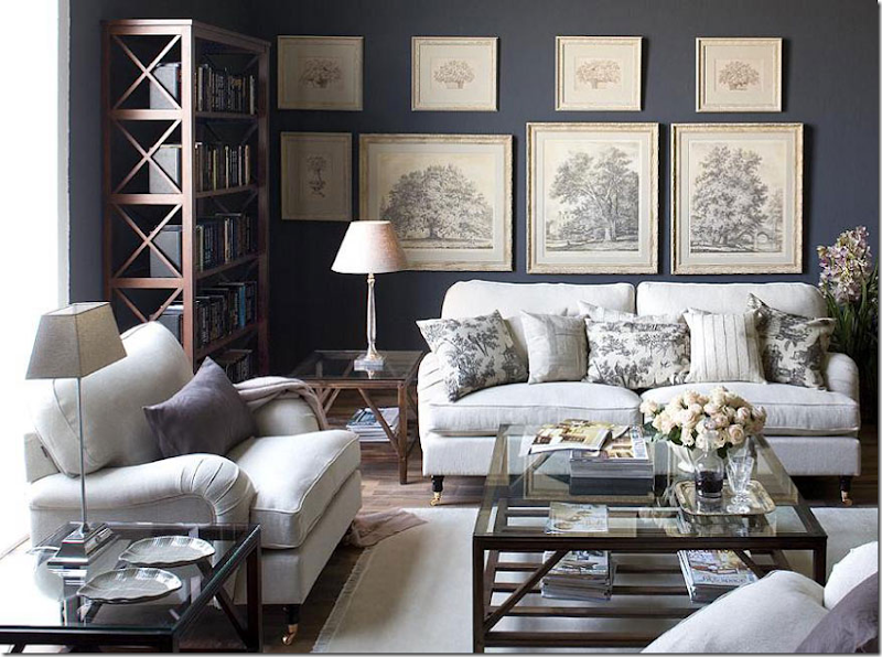 Yum. I love the dark gray walls against all the white linen.
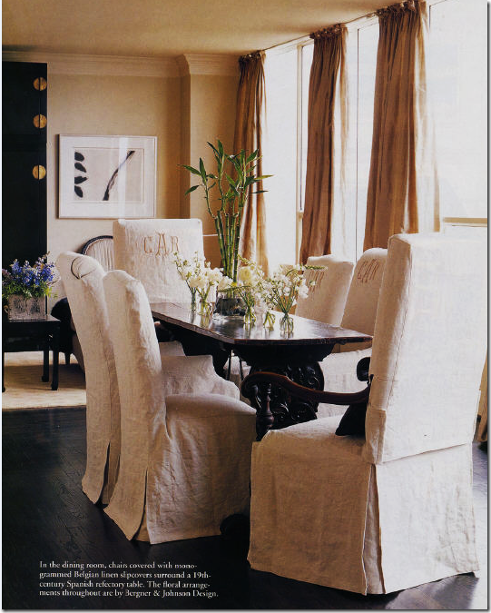
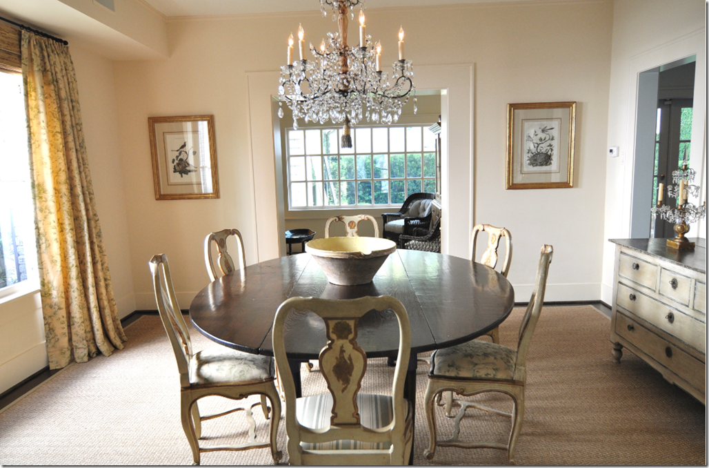
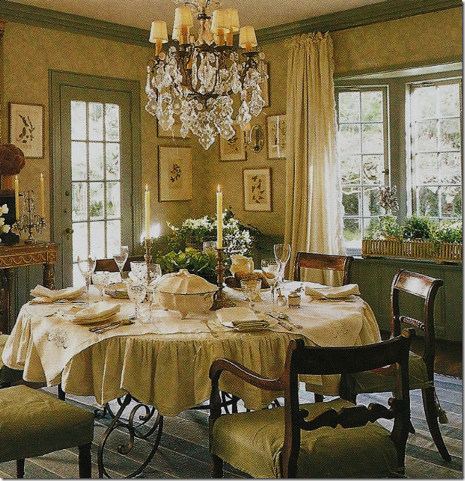
Houston designer Renea Abbott used Belgian linen on her dining room chairs – this is how I LOVE linen: white, wrinkled, slipped! And, it also looks great freshly ironed!
White linen and antiques – is there anything prettier?
The Obama’s designer Michael Smith (I LOVE saying that!) uses a lot Bennison linens in his designs.
And Charlotte Moss used Bennison linen to cover the furniture AND the walls!
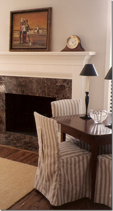
I especially loved striped linen. This fabric gives a little pop to the room. In my first house as a young married woman, I copied Dan Carithers and used this striped linen on every piece of furniture in my living room:
My real first house and my first slipcovers! This was about 18 years ago – and that’s not seagrass, it’s horrible Coir!
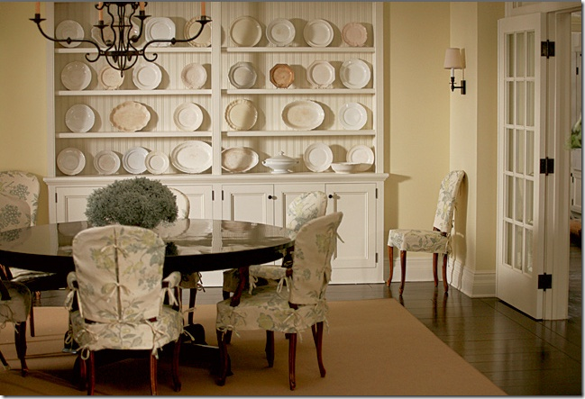
The famous Something’s Gotta Give dining room. I’m convinced this room’s large appeal was due to the plates and the slipcovers in linen. At the time I thought this was Bennison, but a reader alerted me that it is Lee Jofa linen. In person this fabric is divine!

Suzanne Rheinstein used a famous Robert Kime linen in this room. She carries Kime in her showroom – of the few places you can get it.
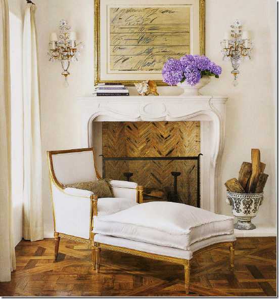 Was this the prettiest Vernanda cover ever? Renea Abott, again, white linen and gilt French antiques. Cy Twombly adds the perfect touch!
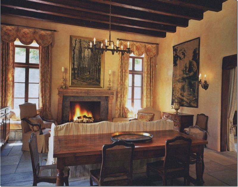
The English love faded, tea stained linen – especially from Bennison and George Smith. Isn’t this inviting and cozy? Exactly the appeal that linen holds for me.
Charles Faudree from Tulsa uses Bennison frequently. Rogers and Goffigon linen is on the sofa, Bennison is on the chairs.
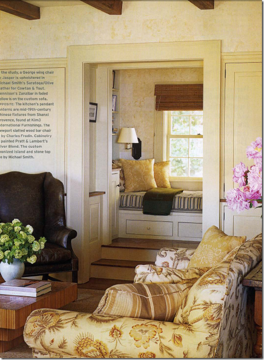
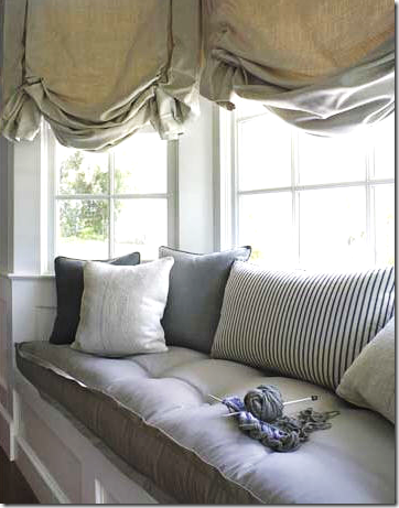
Linen is especially nice for shades and window seats, isn’t it?
Barbara Westbrook used white linen to pop in an all dark gray dining room.
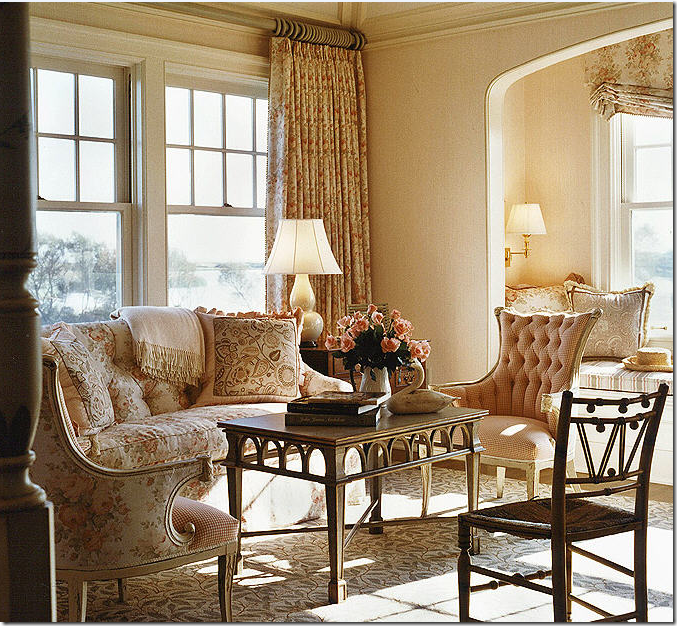
Linen is nice when it is mixed with different prints in one room. The room is painted the color of the fabric’s background creating a softness throughout.
Everyone’s favorite blogger Velvet and Linen, aka Brooke Giannetti, used Bennison in her own living room on the pillows and curtains. Cote de Texas’ Bennison House used the same stripe for curtains below:
The Bennison House shares the same curtains with Brooke. Almost every fabric in this house was made of linen – maybe that’s why I like it so much!
The dining room has gorgeous Bennison in a custom color way. This is my favorite room in the house.
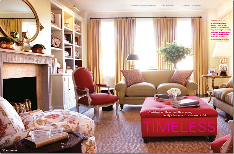
This chair upholstered in Bennison linen made me like this room by Christopher Maya immediately!
Gerrie Bremermman uses natural fibers only: cotton, silks and linens. I love the way she makes her curtains.
I used Bennison Roses in my living room.
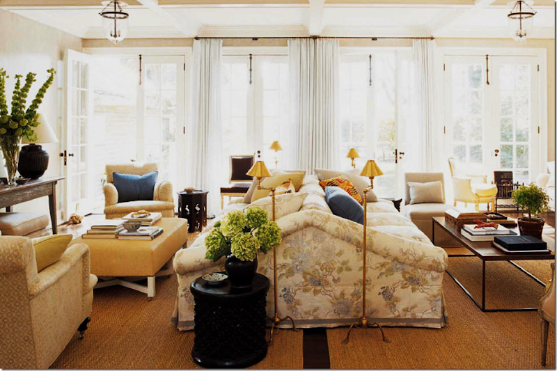
What is prettier than one sofa in linen? How about a two-sided sofa? Jeffrey Bilhuber used a Travers linen here. Travers makes the most gorgeous linens – patterned or solid.
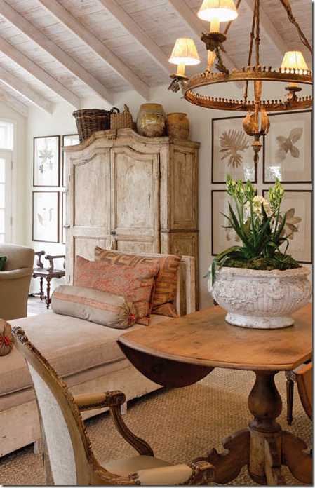
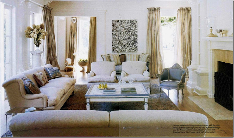
In Dallas, French antiques wear natural linen – a perfect pair in my book.
This house is in New Mexico – and rather than go all Navajo, they went Bennison! All the fabrics are Bennison. To me, this room is what linen is ALL about – warm, cozy, soft, muted, and beautiful. The house was designed by Beverly Jacomini from Houston, Texas. Judith Thibaut the blogger of Studio Judith sent me the photographs by Erika Blumentfeld.
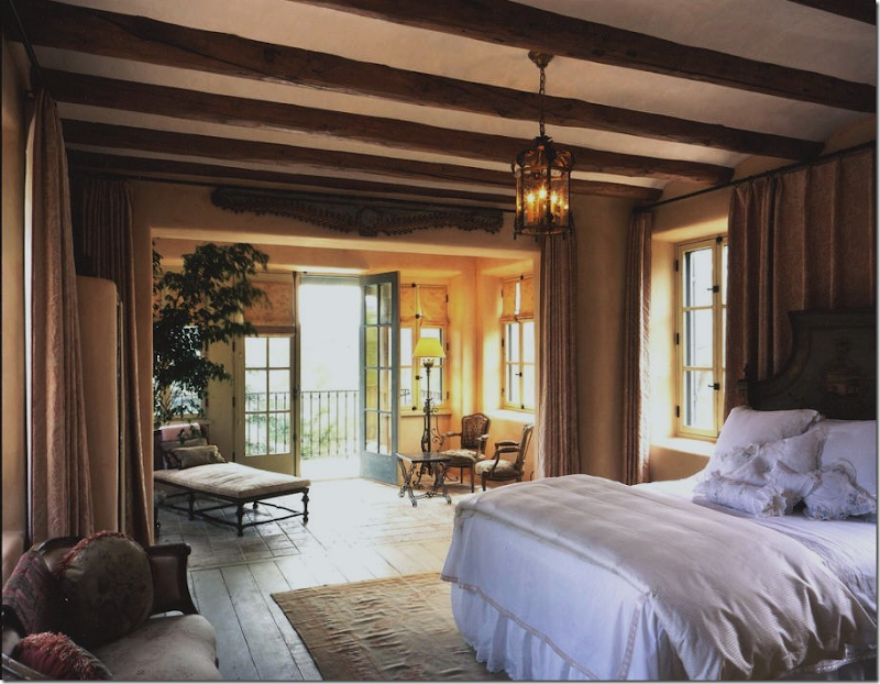 And the bedroom from the above New Mexico house. Notice how the Bennison curtains divide the sitting room from the sleeping area. What a luxury! Work by Beverly Jacomini of Houston, again.
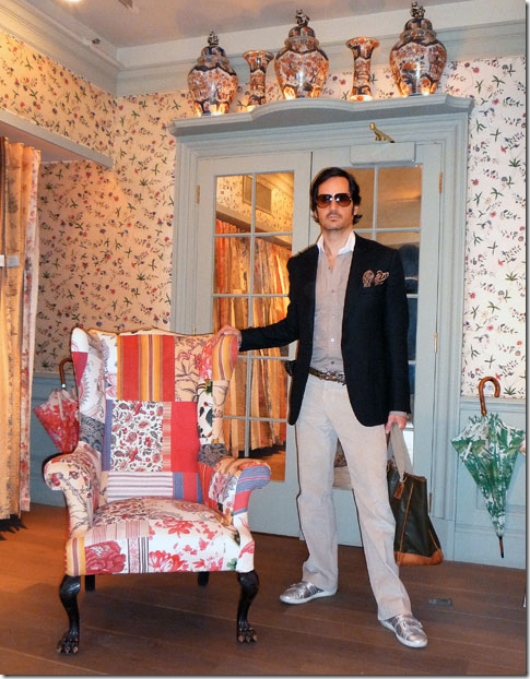
OK – I had to show this. Blogger of What is James Wearing, James Andrews, posed in the Bennison showroom (a few times actually). I can’t remember exactly what he IS wearing, but go here for the description. James – you are TOO handsome! You need to model instead of doing interior design.
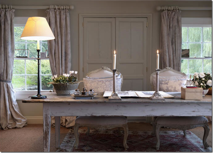
A typical English cottage – with nice, heavy, lined linen curtains. So softly beautiful.
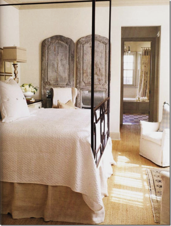
In Dallas, Lisa Luby Ryan went from dark English design to a light Swedish look using white and khaki linens. I love the simplicity of her linen bedskirt.
After Roses, this is probably the most well known Bennison pattern that is on the chairs – Jeffrey Bilhuber, again.
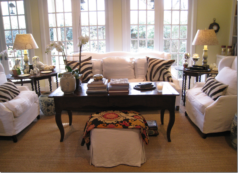
TO DIE FOR: My mother, the famous Betty Rae, called to warn me I was going to love this house in Southern Accents. And boy, was she right (as usual!) I’m not sure that if I actually designed this – I would change one thing. Hmmmm – maybe the pillow fabric! Hey – it’s all personal, you know! This is design that I LOVE: – white linen, slips, seagrass, zebra, skirted table, taffeta, cane, chandelier, mirror, books, and antiques. What – no sconces? What’s wrong with Jeff Woosley? haha. But seriously – this probably doesn’t appeal to you as much as it does to me – because that is what makes it “all so personal.” To me, it doesn’t get much better than this. The rest of the house is even better.
The Tanglewood House: we used a gorgeous, heavy linen on the curtains and on the lampshades. Hi MIMI!!!!! I miss you!
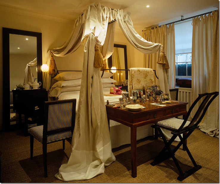
English designer Mimmi O’Connell uses yards and yards of French linen in her bedroom in London. How wonderful can a bedroom be?
At the Octagon House, Tami Owen used linen throughout. These shades were a personal favorite of mine.
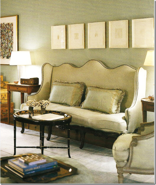
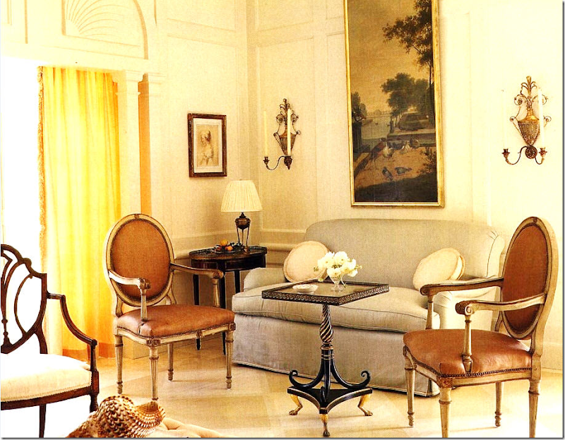
Seafoam linen and French antiques (probably from M. Naeve!) – in a Houston house that is one of my favorites, EVER! The sofa is a true beauty and the linen just enhances it.
The same Houston house with a linen tablecloth and curtains. Greens, creams, and a blue striped rug – magnificent!
Bennison linen: today the company is branching out. After years of tea stained, muted fabrics – new vibrant patterns are coming out daily. Some are vivid blues, but many are just vivid! It’s quite a difference, but to grow as a company, you need to change. I would guess that the new fabrics are flying off the shelves - the color combinations are fabulous.
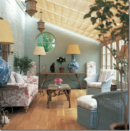
Gilly and Geoffrey Newberry, owners of Bennison (and my personal friends now!) added this conservatory onto their English country manor. The house is filled with gorgeous fabrics, as you can imagine! Bennison sells these wonderful oversized blue and white lamps.
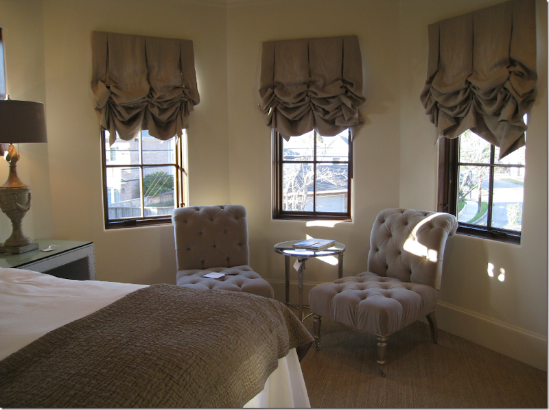
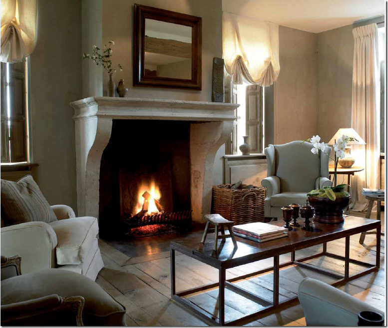
Belgian design is all about linens and limed woods. The two seem to go hand in hand. Notice the lovely linen shades – that kind of folding is hard to achieve with just any fabric – linen seems to be the best.
Suzanne Rheinstein loves linens. This Florida house is one my favorite of her designs.

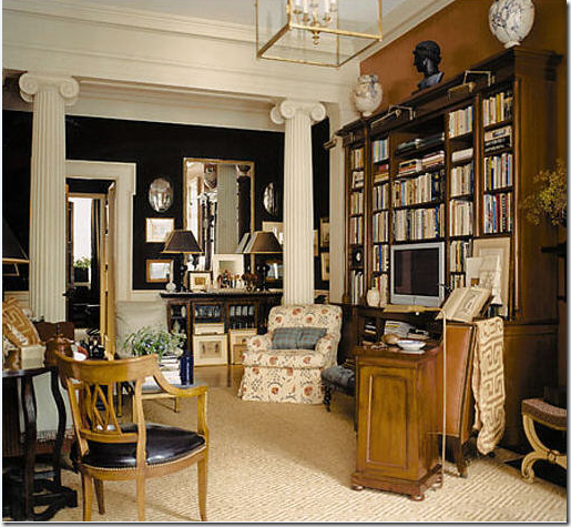 Sometimes, a fabric is so special, just a piece of it “makes” an entire room: here a Robert Kime linen on a club chair plays that role perfectly.
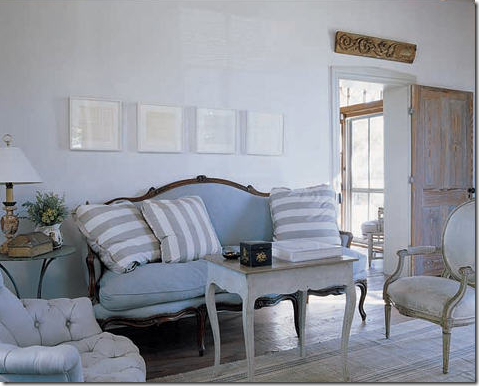 This farm in Fredericksburg is furnished quite sophisticatedly for the country, don’t you think? If I had a farm, I would furnish it exactly this way – with lots of linen!
Linen and silk taffeta: what Lars Bolander does best!
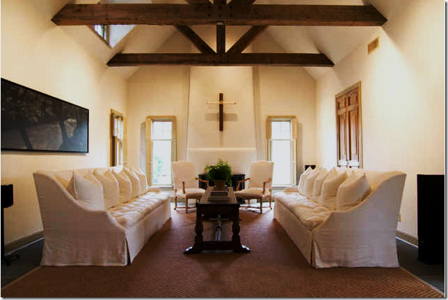
This house for sale in Houston is so simple, it almost does resemble a place of worship! The white linen sofa are just gorgeous I think – so Belgian in style and mood with their high, elegant backs.
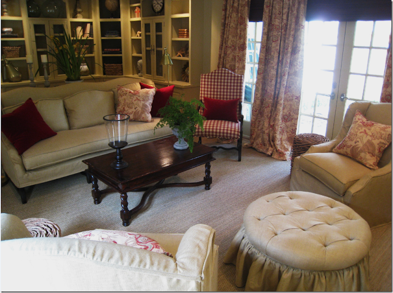
And finally, the family room in the Tanglewood house. We used all linen in here – mostly slipped except for the ottoman for easy cleaning. The curtains aren’t Bennison, they just look like it! By choosing a substitute to the extra pricey Bennison, we were able to do more in the room since we didn’t have to pay for 40 yards of Bennison!!
I hope you have enjoyed my first installment of Cote de Texas - Top Ten Design Elements. Can you guess what #2 will be? Why not play along and make up your own Top Ten list and then we can see who comes closest to my list? I hope you all had a safe and healthy Fourth of July!

