La miniatura corresponde al libro que trajimos de la feria de Paris en febrero " Miniature au point de croix ", un libro al que ya estoy sacando partido. Está bordado con una hebra sobre un hilo de la trama, lo que conocemos por 1/1 en un 28ct.


I have mentioned before that I am obsessed with lanterns these days. Not just any lanterns, of course – that would be too easy and cheap – but antique French lanterns like this:
This beauty came from Chateau Domingue, the wonderful architectural elements store in Houston. But, even though I love the antique lanterns, they can be very pricey. So imagine my delight last summer when I happened into one of my favorite shops, M. Naeve, and found not one, but two identical lanterns – albeit reproductions – at a very decent price. Sold! I knew exactly where they would go – my family room and the stair landing. But, it was going to be a long, hard road to get them hung and I knew exactly why my beautiful new lanterns were going to become a major issue in the Webb household. This is one of the issues:
Issue I: The ceiling fan that has been hanging in my family room for 15 years.
Issue II: Ol’ Mr. Slipper Socks Man himself.
Now understand, I hate to brag, but my house is my domain. I, and I alone, am in charge of each decorating decision. And by large, that’s a true statement. Except for a few issues – one of which is ceiling fans. Mr. Slipper Socks Man has to have “air moving around” to be happy – even in the winter. And it’s not just because Houston isn’t scalding hot (which it is) but maybe, just maybe, if he would let me move the thermostat down from 78 degrees he might not need his “air moving around” 24/7 – but that’s what he claims he needs to be happy. And I’ve humored him and let him ruin my bedroom and my family room with his ceiling fans. But these two gorgeous lanterns were just too much to pass up – and frankly, I’m tired of humoring him. I hate ceiling fans and I’m done with them. But to get them hung I knew it was going to take a lot of skillful psychological maneuvering. I was up to the challenge.
OK, it took longer than I thought. The two lanterns sat in the garage for a year, waiting for him to change his mind about his insistence on a ceiling fan in the family room. After waiting in vain for a year, I finally had to take the matter into my own hands. The lanterns needed light kits installed, so a few weeks ago, I dragged them out of the garage to Alcon on Alabama who miraculously electrified them both in less than a week. When the lanterns were finished I brought them home and placed them on the floor by the front door - a BIG hint. The lanterns sitting by the front door seemed to say: “Hey, Mr. Slipper Socks Man – we aren’t going away. We’re here to stay, get used to it, bud.” So, they sat there for a week, and we never once discussed them. But he knew, he knew exactly what I had on my mind. And bless him, he is so sweet – and I guess that’s why I humor him because, he is the sweetest man in the world. He finally comes up to me one day, out of the blue, and we have this conversation:
“You can go ahead and put up the lanterns, I’ll just get a space fan.”
“Really? You don’t mind? Because I thought I could always just put one on the landing and the other one in the guest room.”
“No, go ahead, it’s O.K.”
See? I told you how sweet he is. Had I only known then what plans he had in his mind.
Sam and Randy Bennett, the best electricians in Houston, bar none, (these guys can install a sconce anywhere and not leave a mark) came out and installed the two lanterns the next day. One went on the landing, the other in the family room. To tell you the truth, I am in love. Do you blame me? Look:
Like I said, I hate to brag, but does a light fixture get any prettier than this? I’m in love, seriously in love. Yes, I know it’s not an antique, and yes, I know an antique would look better, but hey – it’s good enough for me. In fact, I couldn’t be any happier.
Full on view – wow! To me, this lantern is worth more than a 10 carat diamond and a closet full of designer clothes.
The landing with the second lantern. Love it, but I’m not as “in love” with this as the one in the family room. This is like comparing your Chanel purse with your Cole Haan purse – you like them both – you just like one a little better. Not that I would know, I don’t own a Chanel purse, but I’m assuming I would feel that way.
Another view – hard to get a good shot.
So, Mr. Slipper Socks Man had a migraine the day these were installed and left for work late. On his way out, I told him I would get a space fan for him. Fine, just get a good one, he warns me. You know it!
BEFORE.
AFTER.
I thought this was a good fan. It’s small, but really powerful. Quiet too. And kind of cute, in a old fashioned way. Easy to remove before company comes over, a good compromise. Mr. Slipper Socks Man comes home and admits (he hated to do this, I know) that he loved the lanterns. He actually used that word “love” which is a rarity he reserves for his daughter always, and me sometimes. The fan though, really, really bothered him. A lot. He moved it around a few times. He asked me “have you lost your mind?” – it was:
1. Too small.
2. Not powerful enough.
3. Too loud (it wasn’t!)
4. A total disappointment.
5. It was a big mistake to “let” me take down the ceiling fan and put the lantern up.
He was so miserable he went upstairs to the bedroom to watch TV before the 10:00 news. Another rarity. The next night, he stayed downstairs until only 8:00. I knew he was silently fuming over the loss of his ceiling fan only to be replaced by my kind-of cute retro fan. I figured time would take care of it. I was wrong. The third night he came home with a huge package from Brookstone. I have no idea what a Brookstone is, but I can only imagine how much I loathe that store.
It’s not funny. Not funny at all. I”m not laughing. I am the one fuming now. I mean, really, is HE serious? OMG, just looking at this picture makes me want to cry. And I’m serious about that. I am at a loss of how to handle this. He, though, is in heaven. He proudly points out all the features to me: a remote control!!! It oscillates!!! It’s really quiet!!! (It’s not.) He neglects to mention it’s most obvious adjective: It’s Ugly!!!!
You see it there, on the right by the TV on steriods, another one of his dreckorating ideas. I need a valium. Look how TALL that thing is!!!!!! OH and I almost forgot, he also bought a mini version of this for Elisabeth’s room!!! I might kill him tonight.
Oh wait, there’s more. Mr. Slipper Socks Man is really dreckorating tonight. He moved the rattan child’s size chair in front of the fan to hide it. OOOHHHHHH – yes!!!! That REALLY hides it!!! I can’t see that humongous, ugly, black thermometer at all now. Whew! Problem solved, Mr. Slipper Socks Man to the rescue. Another job well done. Ok, I’m going to go cry now. This is just not getting any better.
Which bring me to this: The Skirted Roundtable is discussing this very issue this week – “Designing for the Sexes” – and no, it wasn’t planned at all. I had no idea I was going to be embroiled in my own “Designing For The Sexes” fiasco. We also discuss - in the Blogging Segment – how to grow your audience. Be sure to listen this week!!! AND as an added bonus this week – we have a new feature: “Saturday Short” – a sort of bloopers from the Skirted Roundtable, things that made the cutting room floor. I haven’t even heard it yet – but judging from the picture of the “recliner” I have a good idea what it’s about!!!!! Very funny!!!
Click HERE to hear!
Ben just read this – he has one request. That I show him looking like a “human being.” Here he is on his company’s web site:
Aw, he’s soooo cute!!!! And he’s cool too!

Fuente: thesingularkitchen.com
Hello and welcome to the Tablescape Thursday blog party. If you are a Cote de Texas reader who is not familiar with blog parties – this is how it works. One blogger will host a party around a very specific theme which other bloggers will then write about. For instance, each week, the popular blog Between Naps On My Porch, hosts a blog party on Thursday centered about beautiful tablescapes. If this is your first blog party – take the time to visit blogs listed here who are each hosting their own Tablescape Thursday – you will be sure to get a host of new ideas for entertaining, either your own family or dinner party guests. By the way, if you are wondering where the blog name Between Naps On My Porch came from – just take a look here! This surely is what all porches should be – comfortable, cozy, and beautiful.
Are you ready for a Cote de Texas Tablescape Thursday Party? Enjoy!
Since it’s not quite scalding summer hot in Houston yet, I thought I would set up the table for lunch here on the courtyard, where I usually blog away at my iron table and chairs from Wisteria.
Everything is so green now, the flowers are at their peak – in a few weeks they will start to get that parched summery look, but for now, May is proving to be the prettiest month on my courtyard. Even more miraculous is the fountain is clean and clear for a change. Once it rains a time or two, the water can turn a little murky. But today it’s crystal clear, so eating by the fountain will be particularly nice and atmospheric.
The pink, fuchsia, and white impatiens were planted over a month ago and they are really filling out.
My favorites though are the caladiums. One summer I had all giant white and green caladiums and each year they get pinker and greener it seems. In another month, the beds will be a riot of tall, thick caladiums – I can’t wait!!!!
One of my favorite spots in my courtyard is this bench with two antique urns on pedestals. The entire vignette is actually my sister Cathy’s, but when she moved to a high rise, I inherited the lot. She is back on terra firma now, but it’s hard to return this to her, although one day, I’m sure it will be back with its rightful owner. A few minutes after I took this picture, the skies opened up and it started pouring. Think about that monsoon scene in the movie “The Year of Living Dangerously” – that’s exactly how it is in Houston. One minute the sun is hot and it’s a beautiful day, the next minute, its raining bucketfuls – not just a little shower, but a hard driving downpour that can deposit inches of water in a short amount of time. Needless to say, I need to change the lunch plans, and quickly.
So, instead of eating on the courtyard, I set up the Tablescape Thursday blog party on the covered porch. Can you see the table hiding behind the plants?
I used an old bamboo folding table between the two white wicker chairs. The blue and white garden stool is from Wisteria, now discontinued which is such a shame!
For the tablecloth – I repurposed a Dash and Albert rug from Olivine, in Uptown, and layered over it, a classic linen placemat edged in blue scalloping.
Lunch will be gazpacho, a chilled soup, so I decided to use two small tureens - from my collection of antique Mason Ware - instead of traditional bowls. Since each piece of Mason Ware is hand-picked, I don’t have a pair, but instead, chose two that blend together. Pink roses fill a silver vase and everything else is made of glass, including the tall dessert stand, used to bring some height to the tablescape.
This Mason Ware tureen in the Japan pattern, is mostly cobalt blue and white with orange flower accents.
And this tureen is green and white with accents of cobalt blue and orange. This piece still has it’s bottom plate, which is really special.
Besides the cold soup, we’re going to be having salad – which will be served on the blue and white transferware plates that I collect. I have just two pieces in this pattern, one of my favorites. It’s such a romantic scene, with urns and a balustrade and columns. Underneath the transferware is a white china plate with a scalloped edge.
Getting hungry…..where’s the food??????? Nobody told me I had to actually cook to participate in the Tablescape Thursday party!!!! And where’s my guest?? Anyone? Maybe my springer Georgie would join me, but she is so scared of the camera.
Everything looked so pretty and elegant on the porch for a change, that I kept it like this all afternoon, just flitting about and admiring it – yes, I am that weird. I had actually forgotten about the “party” set-up all together until Ben came home from work, walked outside and saw me sitting there with my computer on my lap, blogging away – with half our dishes outside. He said - with one eye half cocked – “what is going on? Why is this table all set up?” “Oh, it’s nothing, don’t worry about it. It’s for the blog” I dismissively tell him quickly. Except he was not about to be dismissed so quickly. “You know you are a very, very strange person, you DO know that, don’t you?” Not really. I don’t think there is anything even remotely strange at all about setting up a table for an imaginary party and splashing pictures of it all over the internet, do you??????
To see other Tablescape Thursday parties, go here and scroll down to the end of the post to reach the entire list of participants!
The family room then.
A few months ago I showed you a project I was working on – The Tanglewood House. The clients were living in an older house in one of the nicest neighborhoods in Houston. The debate was whether to tear down the house and rebuild on their lot OR completely gut and remodel. In the end they compromised and did a smaller remodeling job than originally planned, with their sights set on perhaps rebuilding sometimes in the future. I was first contacted by the client, a reader of Cote de Texas, to help pick out finishes for phase one – a gut job of their master bathroom. Out of the space, a new master bathroom was created, along with a new powder room. As work went on, the job got larger, as is always the case. First we would do a minor redecorating of the master bedroom, along with a minor redecorating of the family room. Much work was also to be done outside. In the end – a new roof was put on, outdated dormer windows were replaced, the facade was painted, new shutters were built, new landscaping was installed along with new gates, and on and on. Inside, all the doors were replaced and painted black to give them some presence, and new hardware was purchased. Most of the inside of the house was painted. Plans to restain all the wood floors were put on hold until this summer.
In the family room – we purchased all new furniture, covered with pricey fabrics. Also, a large built in was designed to hide two computer desks for the children. We added woven shades and curtains at the French doors, along with a large seagrass rug. All new accessories were purchased to fill the many added shelves. In short, the minor redecorating job had turned major – as is always the case. The clients’ initial budget was increased too many times to count. When the family room was completed, the clients were very pleased with the results. The furniture arrangement worked perfectly for their TV watching and the new computer desks were functional and in use, day and night. Extra meals were eaten on the gate leg table that doubled as a work space. All in all – everything was wonderful. Except for one thing – well, two things exactly: the living room and the dining room. Both rooms were still as dated as the family room had once been, and with that room now looking so fresh, the front rooms looked even more tired by comparison. Added to this was the fact that I had robbed the living room of two club chairs to be used in the master bedroom redo.
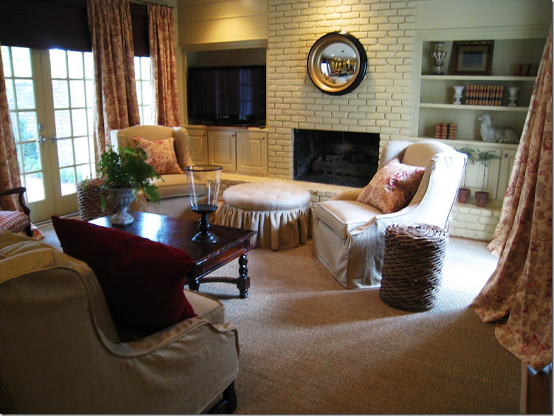 The two new arm chairs swivel for easy TV watching in the family room.
My client, the wife, knew that something had to be done to freshen up the front rooms and quickly – the eldest son was graduating and out-of-town family was arriving for a weekend of celebration. In the middle of April, she asked me – could we possibly redo the two rooms, by graduation day in four weeks? And could we keep to a strict budget – pretend we were on some HGTV Makeover Show where an entire house is transformed for $500 in 24 hours? Sure – no problem!!!
Actually, I liked the challenge. I knew if we worked fast, used what she already owned, picked out reasonably priced fabrics, paid a rush fee to the upholsterer, and bribed Monica – my partner who facilitates all the soft goods – that we might possibly be able to transform the two rooms in a few weeks time, bringing them more in line with the already updated family room. Miracles do happen, don’t they? Here is what we had to work with:
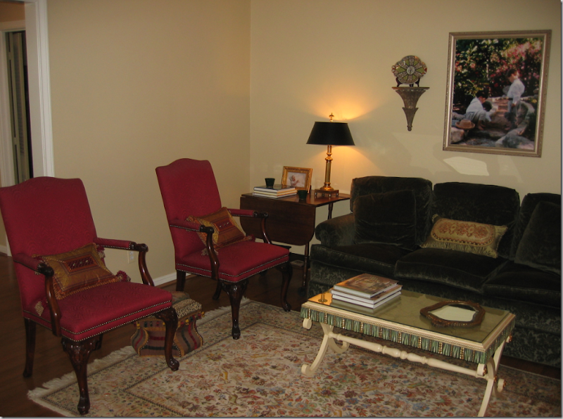 Living Room Before: There was a nice sofa, in a green velvet and two English styled chairs.

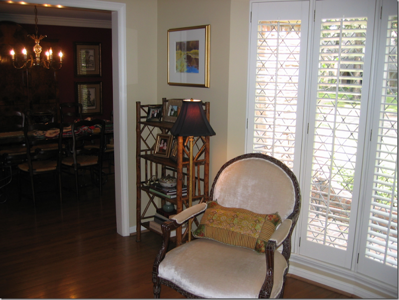 Facing the sofa was a pair of French styled chairs covered in velvet. A bay window – with shutters – lets in the only light in the room and to top that – it’s a northern exposure, which means the room sits in a dark shadow 24/7.
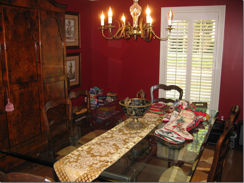 The dining room was painted red, so chic ten years ago. The table was beautiful – a metal, baker’s table style base with a glass top paired with typical French rush seat chairs. There was a gorgeous antique armoire in the dining room that stored all the china. The small window, like the adjoining living room, had plantation shutters and, again, a northern exposure.
The plan: everything would be slipcovered. The floors in both rooms would get large, custom cut seagrass rugs to unify them. Both rooms would be painted in a rich, dark caramel color that would blend with the family room. The three cushioned sofa would be remade with one bottom cushion and two back cushions only. Curtains would be fashioned alike for both rooms to tie them together. A new, larger dining room light fixture would be purchased. A mirror from the old master bathroom would be painted antique gold. A collection of antique egg prints would be framed. All the small accessories, lamps, tables, and what-nots would be sold. There was one end table and one trunk that we would re-use. The only piece of furniture we would buy would be a new coffee table and we would add a larger skirted table.
Since everything was getting slipcovers except for the two red English chairs, keeping fabric costs down was imperative. White linen can be one of the most expensive or cheapest fabrics you can buy, depending on where it’s made. And white linen is also one of the best looking fabrics there is. I found some at Glicks for $16. a yard! Pindler and Pindler came through with an Ikat and a printed cotton for just pennies more. In fact, the fabrics were so inexpensive, yet still trendy and up to date – they were the deciding factor in getting the green light for the entire project. The amount of yardage needed was large and if we had chosen something in the price range of even $25 a yard – the whole redecorating job would probably not have taken place. By choosing great looking, yet inexpensive fabrics, the price tag was very reasonable.
And so, my client and I tallied up all the expenses, the guesstimates and estimates of what is was going to take to totally transform these two rooms. She presented her husband with the figures and we waited for his final approval, knowing that the deadline of the graduation festivities was fast approaching. About a week later, I got the phone call that all was ok-ed by the “big boss” (thank you Mr. P.!!!!) and I ordered all the fabric to be shipped overnight. Here is what the two rooms look like, just a few weeks later:
NOTE: open your browser to full screen to see the photos at proper size. Thanks!!!!
The living room today.
The green velvet sofa was upholstered in muslin, then slipped in white linen. The three cushions became one bottom and two backs for a trendier, more up-to-date look. The red English-styled chairs were upholstered in the Pindler and Pindler Ikat fabric with an exaggerated nail-head detailing. A large mirror was repainted in an antiqued Italian gold and surrounded by white ironstone, picked up at The Gray Door at the Urban Market. White garden stools from Wisteria double as side tables. The oval coffee table, the only piece of furniture bought for the room, was slipped in the white linen. A large seagrass rug was custom cut a few inches from the walls, which were painted a rich caramel color. For side tables, we used an existing Spanish styled, dark walnut stained table, and an Oriental, black trunk on a frame. The crystal lamps are from Restoration Hardware.
Facing the sofa is a large skirted table, topped by the Ikat fabric. The two French styled chairs were slipped with a large scalloped detailing in the white linen. The other Pindler and Pindler fabric, a cotton print, was used for the curtains. Two large urns from The Garden Gate were planted with palms that thrive in low light interiors.


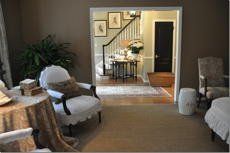 The view facing the entry hall. In the entry hall, we painted the banister black to match all the new doors which were also painted black. An antique gate-leg table was placed there along with four botanicals moved from the master bedroom, now with new ivory mats and newly painted black frames.

Accessory Details:
Old alabaster grapes and books covered in music paper accessorize the coffee table. The piece de resistance of the entire room, to me, is the serendipity of the burlap feed bags. The feed bags were originally purchased on Ebay and made into pillows for my own house. I decided the pillows didn’t look good on my sofa, so they went into the no-man’s land of my garage. For my client’s living room, I had ordered pillows made out of the Ikat fabric. On the way to the installation, at the last minute, I grabbed the feed bag pillows just in case they might look good in the living room. Once the white slipcovered furniture arrived, there was no question in my mind that the feed bag pillows would look spectacular – and in the end, they actually “make the room.” The Ikat pillows? The upholsterer forgot to make them. Sometimes things work out in ways you never planned or ever imagined! I would like to say these pillows were specified from day one, and perhaps I should!
On the skirted table, I used a coral rose I had bought for the client at Urban Market, along with some trendy antique spine-less books from Antiques and Interiors on Dunlavy. At Olivine, I picked up the metal finial in a rusty finish.
Since the two rooms are connected, it was important that they flow visually. To achieve this continuity – the walls in both rooms were painted the same caramel color and both rooms have seagrass matting. Also, the curtains in both rooms are identical.
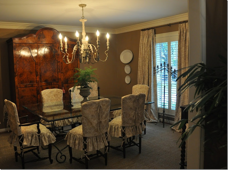 The Pindler and Pindler print was used for both the curtains and chair slips. The large chandelier comes from Aidan Gray. The gorgeous burled wood armoire is the focal point in the room.
Facing the window. The curtains, made identically to the living room, help to connect the two rooms together visually and also soften the room. By hanging the curtains right under the molding and out past the window’s sides – the window actually appears larger. Additional ironstone plates and platters purchased from The Gray Door at Urban Market pop against the deep caramel walls and further tie the living room and dining room together.
And the view to the butler’s pantry, onto the kitchen.
A close up of the slip covers. The slips come in two pieces. The top piece has ties that run down the middle of the chair’s back. The bottom piece has a down cushion built into it to make the chairs more shapely and luxurious looking. A skirt with double ruffles is attached to the cushion. Ballet slipper ties run down the back legs for extra detailing. The client and I have discussed one day replacing the glass top with a piece of stone – yes/no/maybe?
Let’s take one more look back at where we started four weeks ago:
The living room with an area rug, green velvet sofa and red chairs. Certainly nice – certainly pretty, but ready for an update after a decade’s time.
Once the club chairs moved to the bedroom, the living room needed a change.
A few weeks later, the same room with the same furniture and just a few new accessories and rug.
The dining room – painted red, with a too small chandelier, no curtains and bare dining room chairs. Again – very nice, very pretty, but ready for a freshening up.
The dining room today – flowing into the living room – creating a cohesive look between the two rooms. The dining room’s slipped chairs soften all the hard edges, making the room warmer and cozier. The larger chandelier is more in scale with the armoire and the curtains add additional softness to the room.
I hope you’ve enjoyed reading Chapter II of The Tanglewood Redo. And I hope I have shown you how much change can be accomplished with a little paint and a little (well – a lot) of fabric. Another important key to successful redecorating is editing. These rooms were filled with numerous small tables, lamps, art work, and accessories – all built up over the years. By clearing it all out and using just a few key pieces, what is left became more visually attractive. And, most important to remember when redecorating - you don’t always have to start all over. Consider what you have and how you can reuse it. Just by making slipcovers and reupholstering two chairs – we were able to achieve a totally different look.
Look for this house’s master bedroom and bathroom, and powder room remodeling in the next few weeks! To read the original Tanglewood Redo story, please go here.